TestingTime
Do you know what it takes to develop a great product? You have to talk with your target group and let them test it. If you do it right, you can improve your product and you end up one step closer to a world full of happy users (holy moly doesn’t this sound amazing?).
TestingTime, founded in 2015, helps to craft this vision. They find the right test users for any product in no time, they coordinate appointments, handle payments and facilitate research tasks.
Ginetta came into play to make TestingTime’s key landing pages stand out and thrilling, but also easy to navigate. By story-driven pages and a fresh look we made the experience when searching for the right test users more easy, efficient and delightful.
TestingTime’s website is visited by a lot of different people with different goals and needs. Some need to organize or schedule user tests, others want to register as a test user. The goal was to create a place where everyone can easily find what they are looking for. To achieve this in a playful and delighting way we used a storytelling format. Thoroughly tested of course.
To engage the target audience and enhance usability, we created user-centered stories and a new design concept we tested early on.
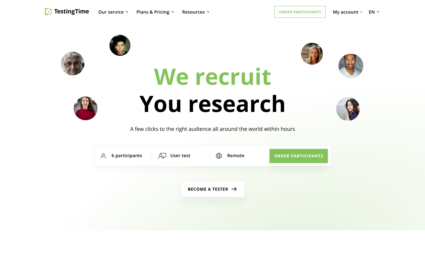
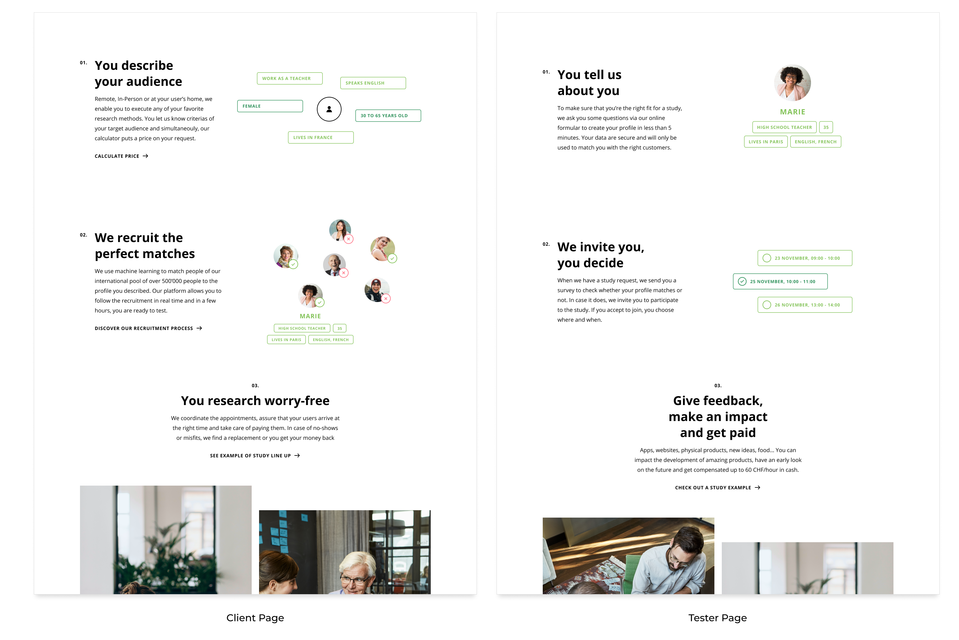
Together with the team at TestingTime, we redesigned two key landing pages: the landing page for customers that want to test their products and the page for (potential) testers who want to register. Additionally, we improved the access to the tester page since one would first land on the customer page and could hardly find the access in the past.
At the very beginning we identified the relevant topics for the different audiences. What are they looking for when they visit TestingTime’s website? What are their desires and tasks that they are trying to fulfill? What problems do they have that TestingTime can solve? At the kickoff workshop together with TestingTime we used the semantic differential measurement technique to have a common understanding on how the pages should feel like to the audience. Based on our results we defined design principles to keep us on track during the project.
Based on our research, we developed appealing stories with the audience as the main character on stage. At this point, we only focused on the text rather than on the page structure. This approach allowed us to make the pages story-driven rather than element-driven. The result: more relevant and interesting pages to scroll through.
Something we never put enough stress on: Early testing always pays off! So when our story was in a good state, we quickly iterated on very simple page layouts and ended up with a mid-fi prototype that was enough to get the most out of a first test. At the end of each test, we asked every tester to rate what they saw with the semantic differential that we defined during the kickoff workshop. This showed us how they feel about the page in comparison to what our goal was.
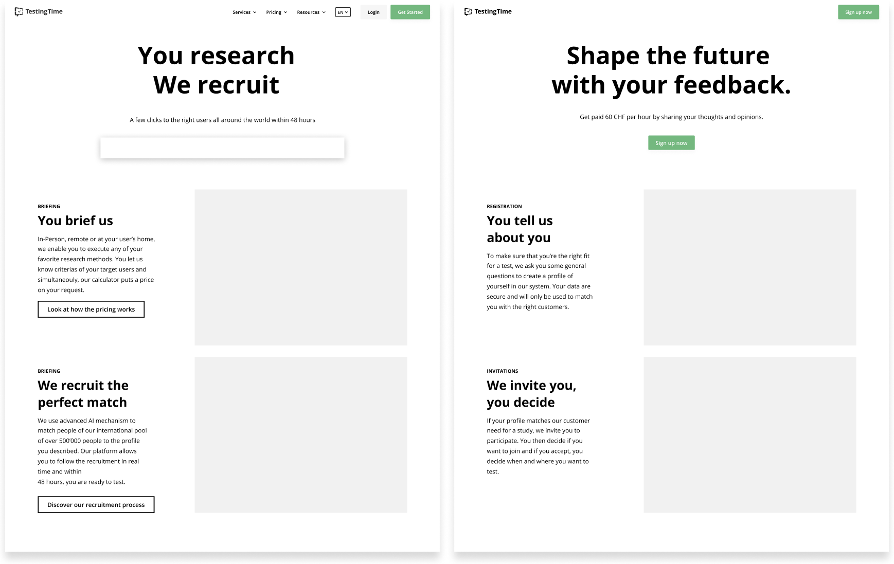
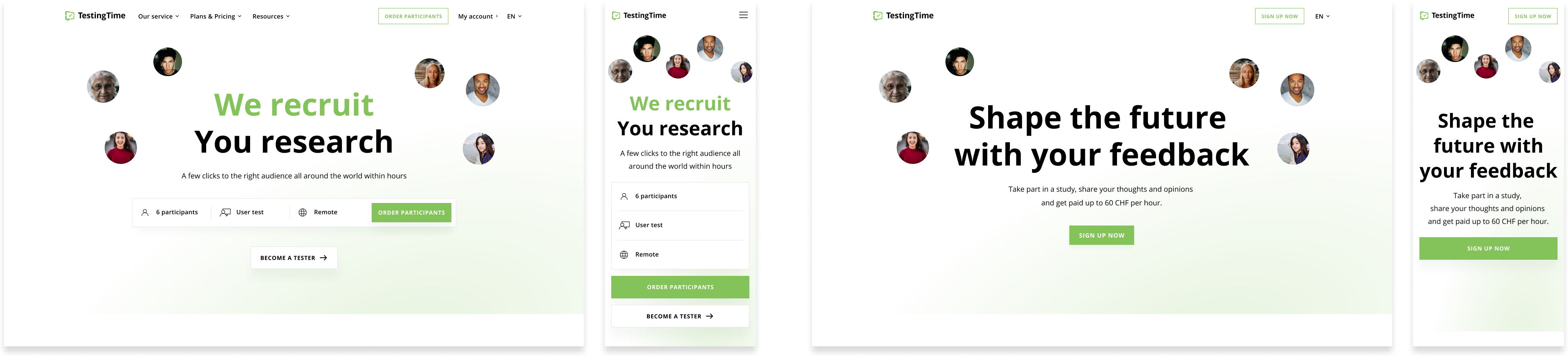
After improving the concept based on the tester’s feedback, we invested time to work on the visual design of the page. While still following TestingTime’s brand, we worked on new elements that would convey the way we wanted the page to feel. This included illustrations creation, motion design and typography work. The final concept was tested a second time and reached TestingTime’s expectations.
Preview of the visual design with subtle animations
Saying that your product or service is the best is not enough. You have to give your audience the chance to see the true value of your product or service by telling them a story they can identify with and empower them to be part of it. We achieved that by analysing the audience and their needs and reflecting them in the text and design. They can now move more easily and quickly through TestingTime’s world and see what they have to offer. This was only possible by speaking with the audience and that’s why even when time is limited, doing user research is key.
Despite the difficult timeline, we have received the usual Ginetta quality: our two key landing pages are simple, beautiful, and easy to use. Thank you Ginetta!

Céline Bergamin
Research

Katharina Herzog
Product Partner

Daniel Jordi
Business

Romain Allemann
Design