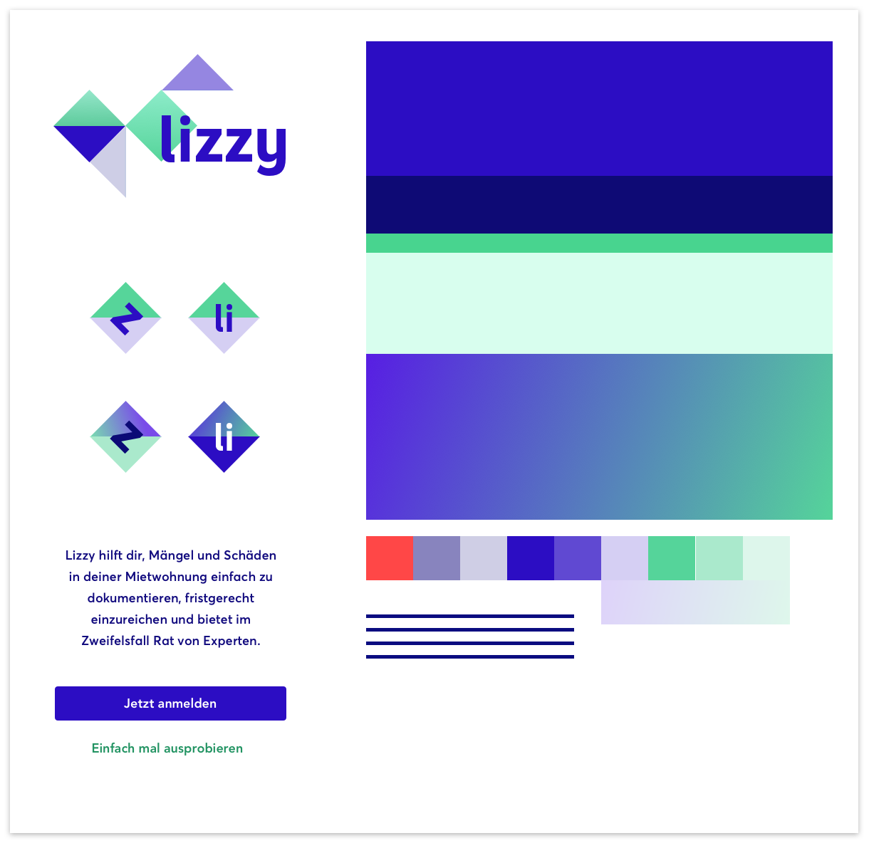
lizzy
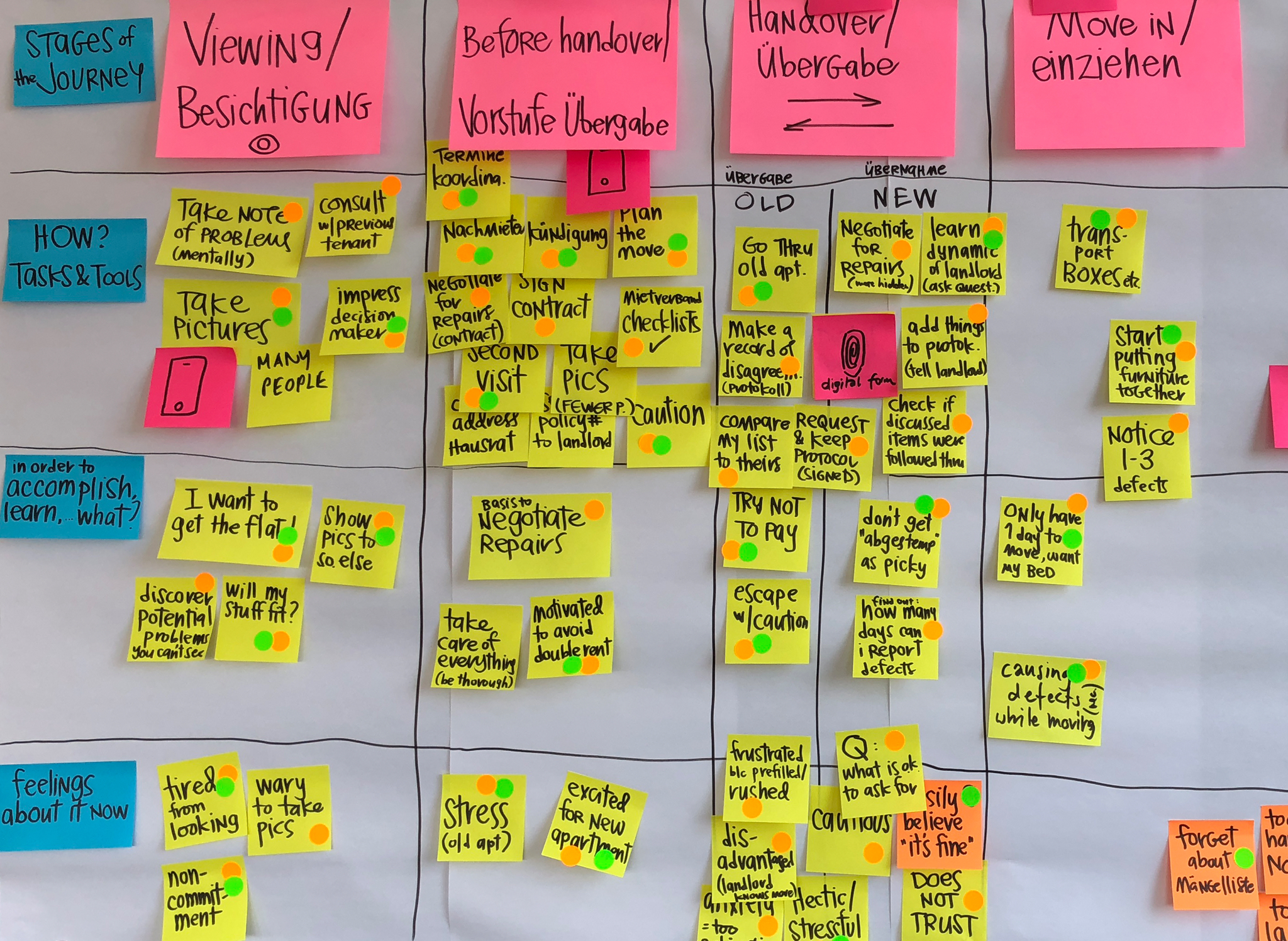
As a new tenant of a rental property, it’s easy to overlook small damages and defects during the initial walkthrough of a property. After having moved in, the new tenant has between 10 and 30 days to report any of the overlooked defects. Indeed 80-90% of Swiss tenants create such a list after having moved in, as legally speaking, this can take any form, be it an email, a spreadsheet or a handwritten letter. lizzy is the first app of its kind in Switzerland, making the work of tediously documenting defects a quick and easy process. The app allows tenants to submit their lists on-time and provides the respective property management or landlord with a standardized, structured document.
Before lizzy, the experience of handing in a list of defects was fraught with mistrust, lack of knowledge and numerous tedious tasks. We saw the greatest potential for improvement in optimizing for efficiency and minimizing the administrative effort for the user. Additionally, we wanted to give users the security of submitting a formal document with all the right information.
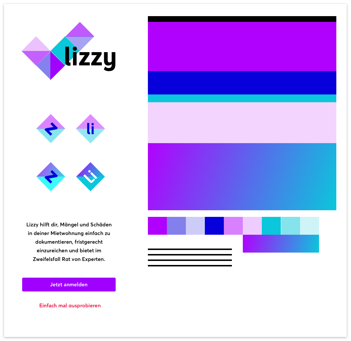
Documenting defects has never been easier
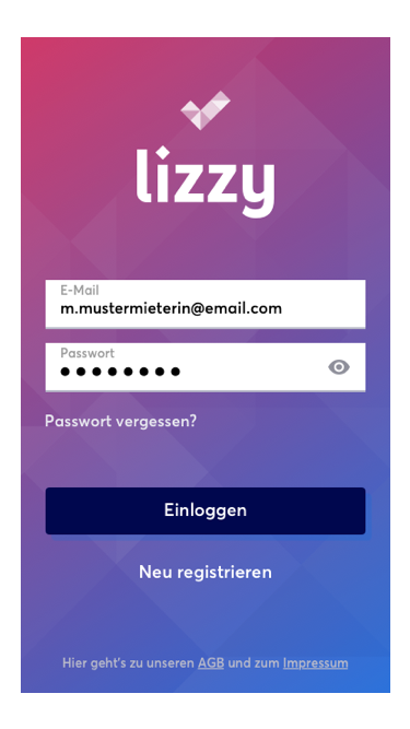
Login
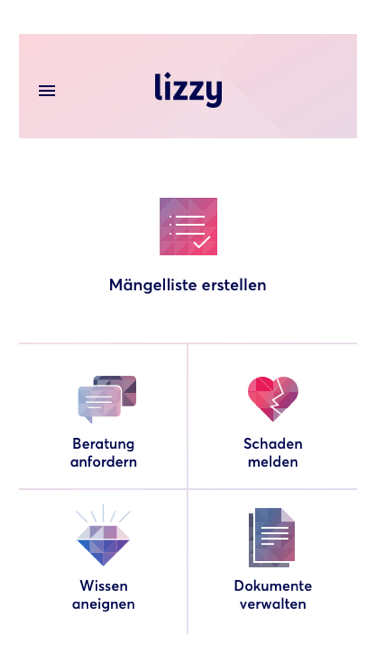
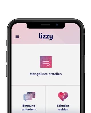
The Hub
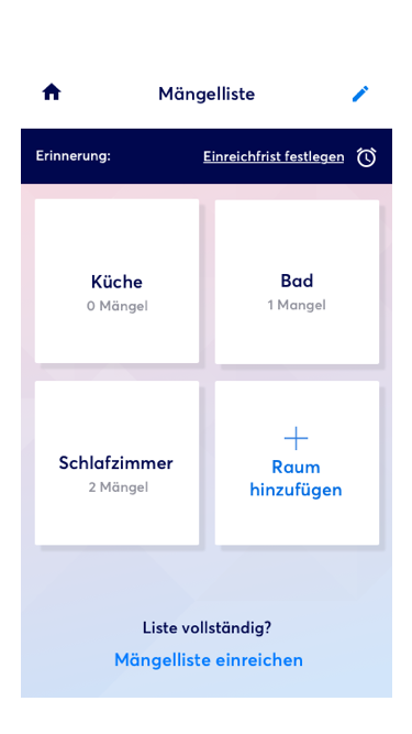
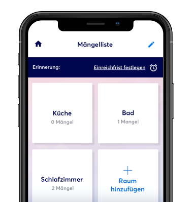
Overview of rooms
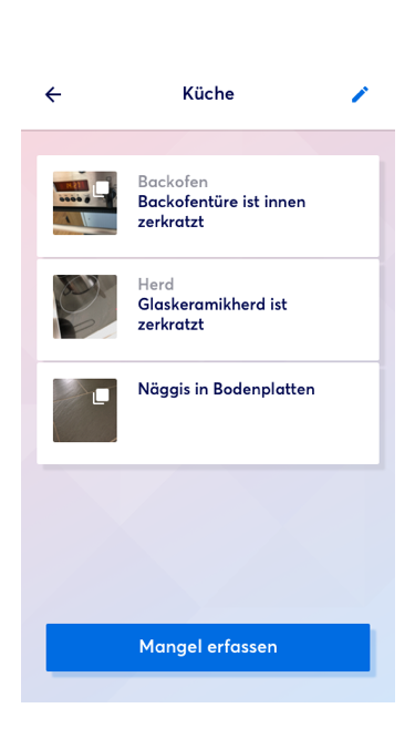
Overview of defects
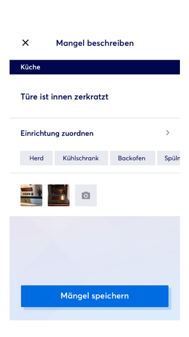
Details of defect
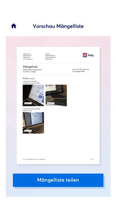
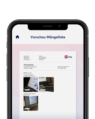
PDF preview
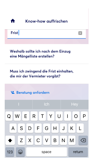
Search in FAQ
Apple, the Apple logo, iPhone, and iPad are trademarks of Apple Inc., registered in the U.S. and other countries and regions. App Store is a service mark of Apple Inc.
Google Play and the Google Play logo are trademarks of Google LLC.

Frank Salathé
Strategy

Jessica Goodson
Design

Andrea Aebersold
Design

Pierre Berchthold
Frontend

Joël Bez
Frontend

Rafaela Guerra
Frontend

João Rodrigues
Frontend

Artur Heinze
Backend

Gian-Marco Schmid
Research

Dominik Bruderer
Frontend

Sophia Littlejohn
Frontend