TWINT

Twint is a Swiss digital wallet. It was released in 2015 and users' reports showed that the product had some usability issues. We joined the TWINT product team in order to improve the identified issues and optimise the information architecture.
Little did we know that ahead was a complete redesign of the app and its functionalities.
Part of the problem was that the information architecture and navigation didn't conform to user expectations. While the idea was innovative, the user interface wasn't intuitive and was therefore not more convenient than existing “analog” payment options. Our task was to improve the UX and ensure the user understood that Twint is much more than a payment app.
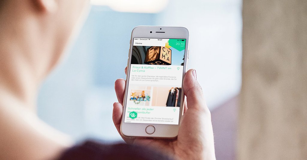
The old Twint interface. Source: Twint
Since the redesign started, we've been faced with three challenges. The challenges were transformed into three goals:
Users don’t want to pay attention. Much less are they willing to struggle through the app to complete their task or try to understand what all the extra clutter that Twint is offering them is all about, if they can just pay the conventional way.
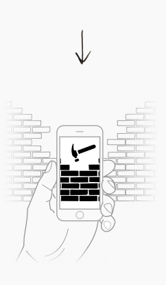
By providing easy access to the main functionallities we remove barriers between Twint and their users. That way we fight customer indifference by improving usability and hence optimizing user experience.
The app was lacking a clear value proposition for the user, because all features had visually the same importance. The benefits and incentives for Twint users were not clear and it took some work to navigate them.
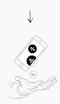
The only way to convince users that Twint is better than their usual way of payment is to add value. Pre-ordering food or peer to peer payments make Twint relevant to users.
People in Switzerland are not used to mobile payment. The card or cash payment behavior is programmed so strongly in the user's mind that we need to change the habit. (It’s hard to change the behavior).
The hardest part will be removing old habits and building new ones. Twint needs to be convenient and relevant. We can achieve that with personalisation, gamification and notifications.
Workshops clearly demonstrated that if we want to reach our goals we need to expand Twint's ecosystem of functionalities that exceed the mere act of mobile payment. Payment is simply one functionality that “lives” among several others. Its relationship to these in the context of a digital wallet must be clear. Defining the full Twint experience will enable the user to save money while they pay.

A designer’s job does not end with a concept, wireframes, and visual wow. A large part of our job is about bringing stakeholders to the table, iterating according to common requirements, and guiding design decisions.
Ginetta’s approach is a perfect fit between business requirements and user’s needs. The solution they came up with was completely new, extremely user-friendly and clearly met the business goals.
After numerous iterations we arrived at a solution that corresponded with the goals of all stakeholders: product vision, product management, business development, marketing and sales. Most importantly, our solution would be relevant and understandable for the user.
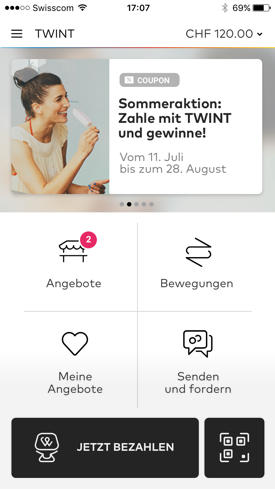
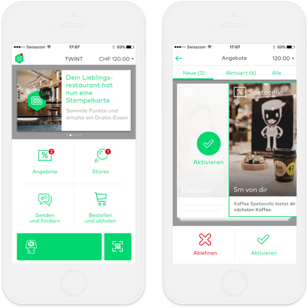
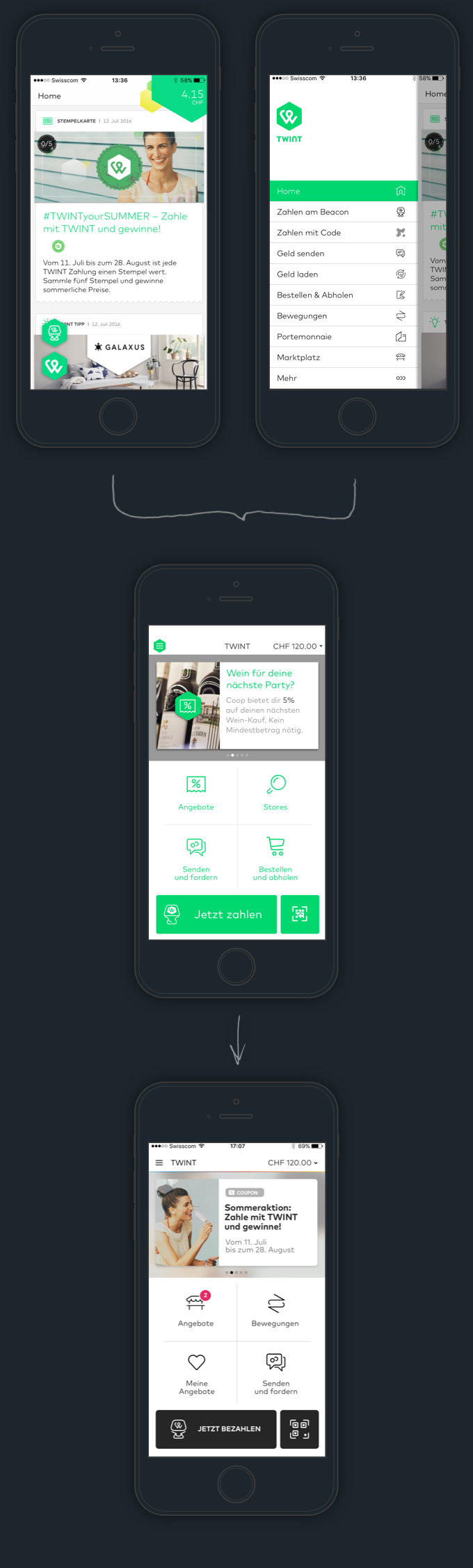
Instead of making the user choose their use case in a huge unstructured menu drawer, where there’s no clear hierarchy, we focused on the five main functionalities and made a structured dashboard that’s clear and intuitive. Once the user starts one flow, like payment or pre-order, they have to return to the dashboard to start a new flow for a new use case. Testings showed this solution as super intuitive, one that doesn't confuse the user.
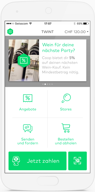
Established navigation patterns that the users are familiar with
Dedicated area for relevant coupons, notification and communication with users.
The clear indication of the current balance includes a quick top-up credit function
The payment button works as a reasurment that the user started an action. Key functionality is clearly visible
Dashboard with shortcuts to most important features
For immediate access to scanner, which is important for different use cases.
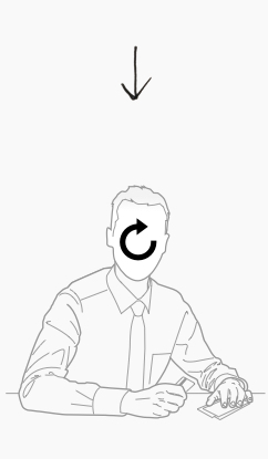
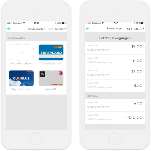
Users can initiate the payment process in a number of different ways. The payment process starts automatically if the phone is close to the beacon. A precondition is that the bluetooth is on. The placebo button starts a guided payment process to help first-time users. Tests results clearly showed that it's a user requirement.
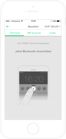
Animated tutorial shows the user that they won’t be able to connect to the beacon if their bluetooth is turned off.
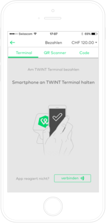
Once bluetooth is on, the user only needs to hold the phone against the beacon. We added an action for force-pairing in cases when pairing fails.
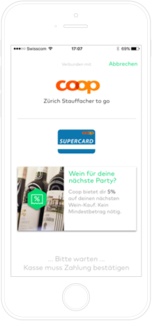
The coupons, stamp cards and loyalty cards are taken in consideration automatically on payment. The user can still reverse the process.
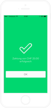
Clear indication of payment, with a confirmation button for conscious confirmation.
Twint is much more than simply using your cell phone to buy groceries. The tests gave us great insights into what the users understand as added value. Before, the home screen was a stream of offers, coupons, stampcards, and tips that was both confusing and frustrating for the user. We decided on four main use cases:
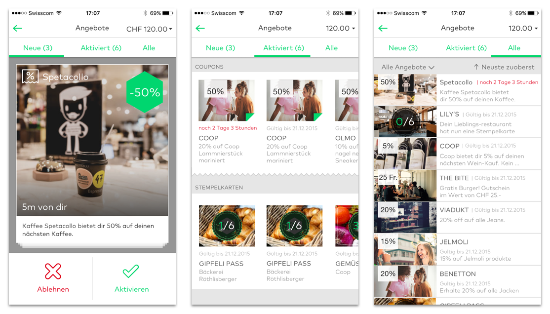
Coupons - Save while you buy
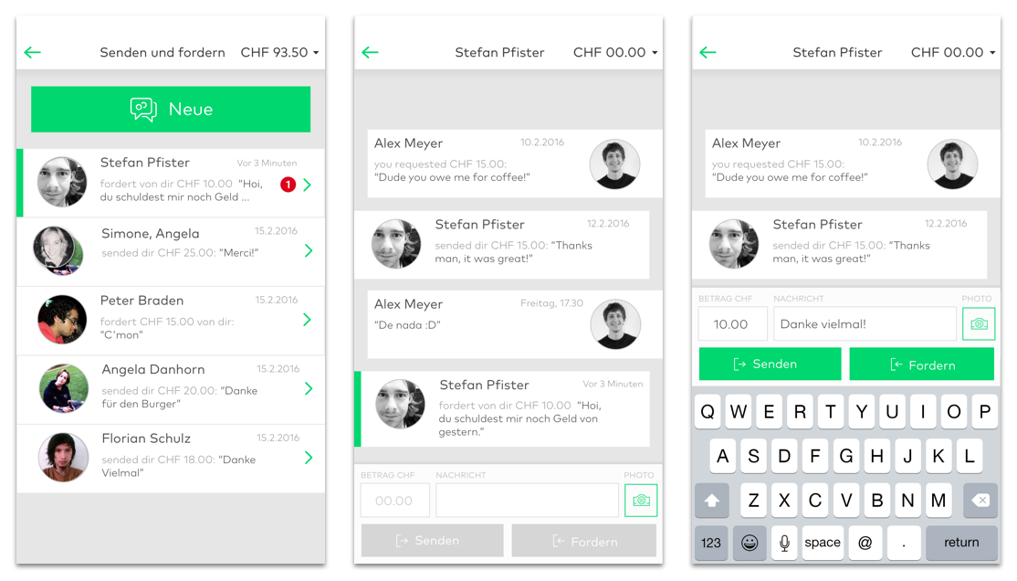
Peer-to-peer - Transfer money.
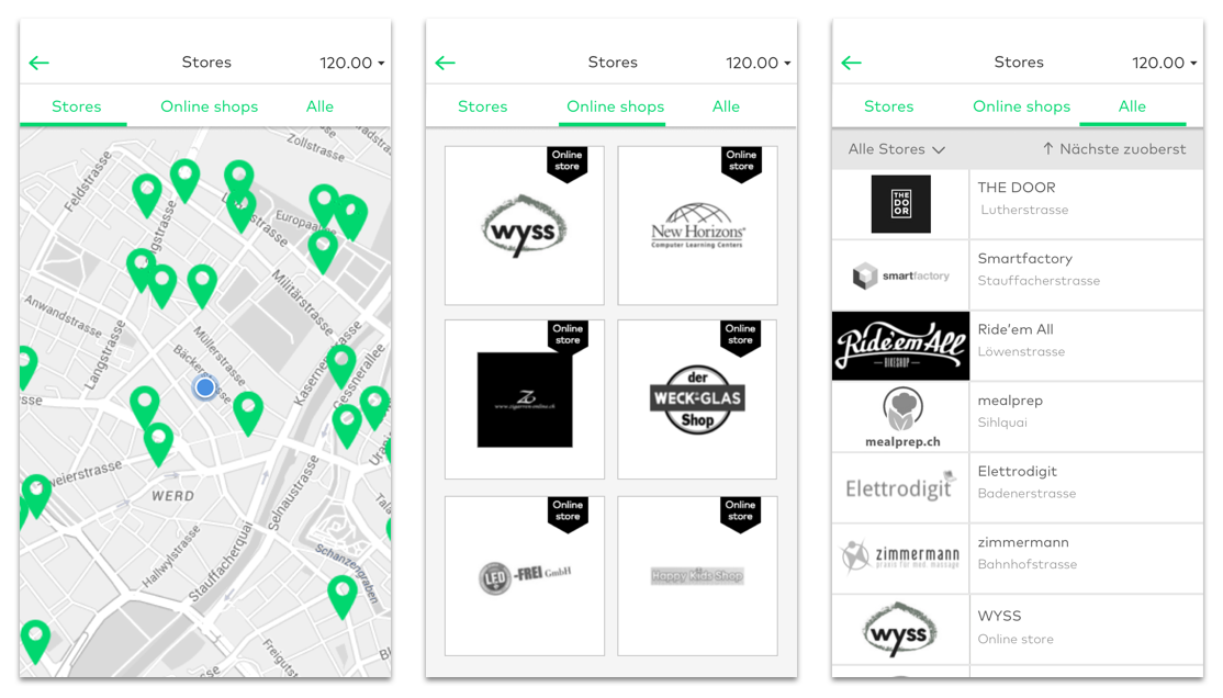
Nearby offers - Find the stores around me.
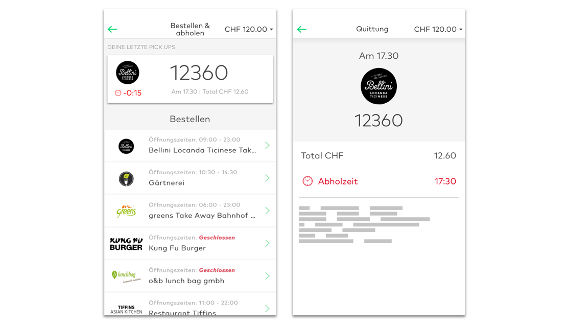
Pre-order - Skip the line.
We need to change people’s habits and convince them that paying by card is easy but paying by Twint is easier and even cheaper. We used notifications, personalization, gamification, and convenience to make the users identify with the product.
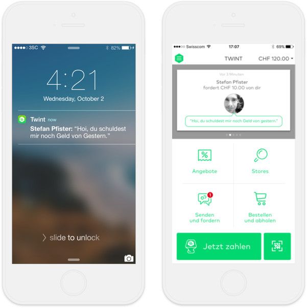
Notifications: Push notifications, spotlight cards, badges and alerts
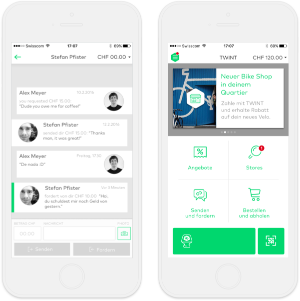
Personalization: People-centric communication and individual offers
Gamification: Loyalty offers and rebates with playful interaction model
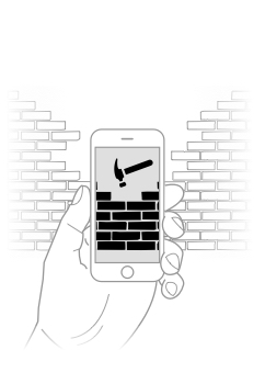
Convenience: All my customer cards in one place and transaction history
By providing easy access to the main functionalities we remove barriers between Twint and their users. That way we fight customer indifference by improving usability and hence optimizing user experience.
A redesigned Twint was launched in early 2017 together with a visual redesign according to the new Twint brand that followed a merger of Twint and Paymit. Twint is now a strong competitor on the mobile payment market in Switzerland. Our research and design helped Twint gain fresh investments and acquire its competitor but most importantly it's changing users habits.
TWINT was a challenging but a wonderful project. We gained important insight, experience and knowledge in the fintech domain and helped our client reach more users. Among other learnings, the fact that convenience is set above all else on the user’s priority list is by far the most important one.

Simon Raess
Strategy

Tibor Kranjc
Design

Simone Reichlin
User Research

Inês João
Design

Marvin-Sebastian Karácsony
Client Partner