Swisscom City
Urban planners strive to optimize traffic in order to improve the life quality in urban areas. They require traffic information in order to take data-informed decisions. Being the largest Swiss mobile communication provider, Swisscom can use their mobile network to provide anonymized and aggregated insights. With this highly available and statistically significant data, investments in today's expensive and inefficient city monitoring infrastructure can be reduced.
Swisscom approached Ginetta to get an understanding of the user needs and design a web application that provides live mobility insights to urban planners. The application should enable them to better plan for tomorrow’s urban infrastructures and ultimately lead to an improvement of the environment and quality of life of the Swiss population. We were able to complete this project within less than one month using a very lean and efficient approach.
To learn about the main user needs and gather first-hand knowledge, qualitative interviews with urban planners were conducted. The goal was to fully understand the potential of mobility insights for urban planners, find out what data is most interesting to them and in which context it is used.
How does mobility change over the course of a day, week or year?
How does the traffic data of a period compare to a typical Saturday?
The data needs to be visualized in a geographical context to make important relations visible.
We aimed to design a web application that visualizes the complex motion data in an easy and clear way. While supporting the urban planner in finding the specific motion data he’s looking for in individual projects, it also offers an open exploration of the data in his area of interest.
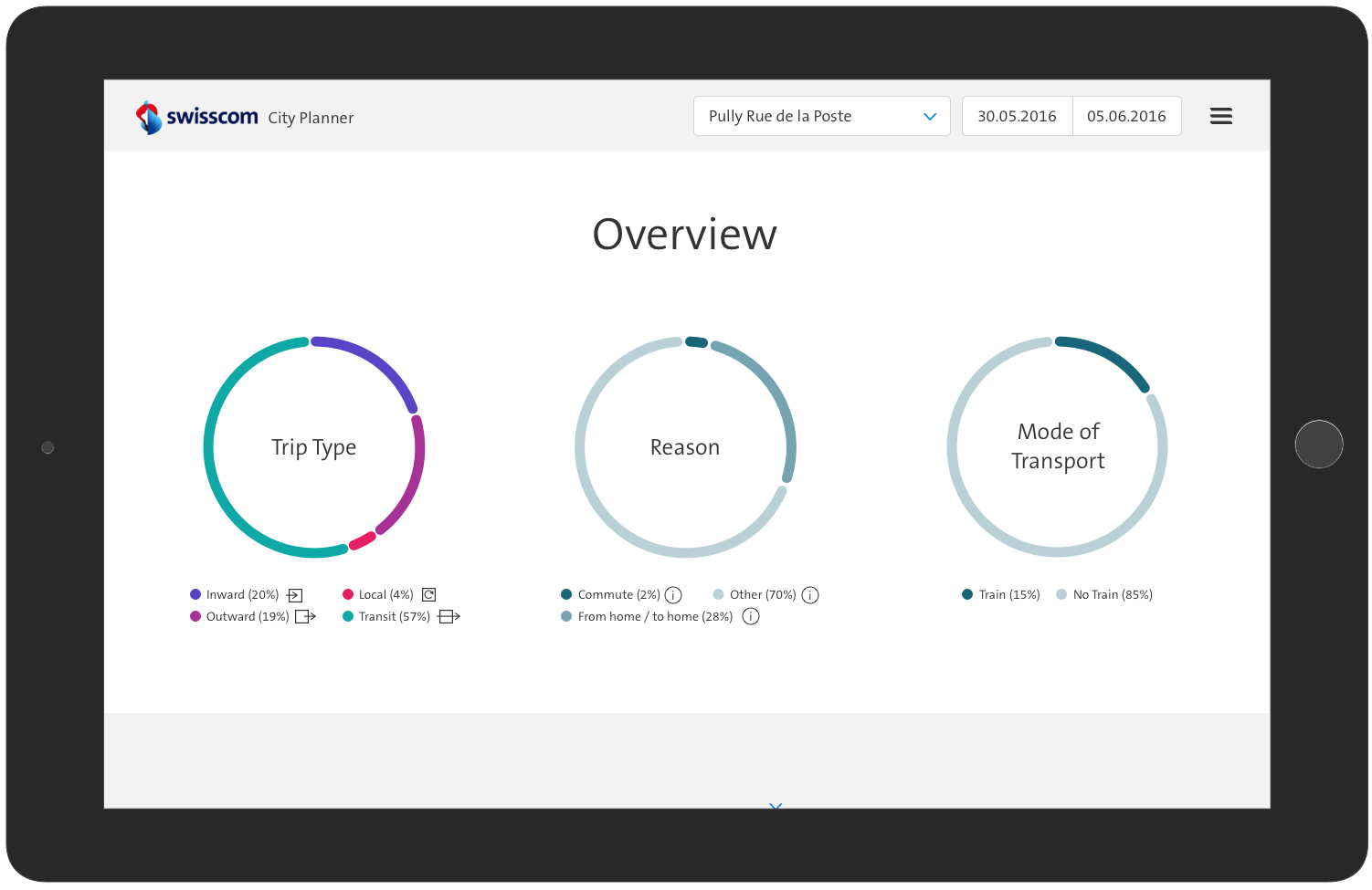
The user is offered a clear overview of the main figures across all trip types. The clear layout emphasizes the data visualizations.
The overview page
Filtering and navigation of trip types is easily accessible without standing in the way of the data. Applied filters are transparent even when the menu is closed. An interactive map sets the data in a geographical context. In addition to the cumulated data view, the user can also play an animation of the motion flow per hour during a time period he defines.
Navigating and applying filters
Interactive graphs enable to create specific graphs and to do comparisons with average data. On hover, the detailed data for the specific section is shown, offering the user an intuitive and engaging way to further explore the visual data.
Interacting with graphs
Swisscom asked us to work with their newly developed Digital Experience Styleguide. Implementing our concept with it, we were highly efficient and at the same time we could even help them to further improve their style guide with new elements. The main focus for the visual design was to find the best way to visualize the different aspects of the data.
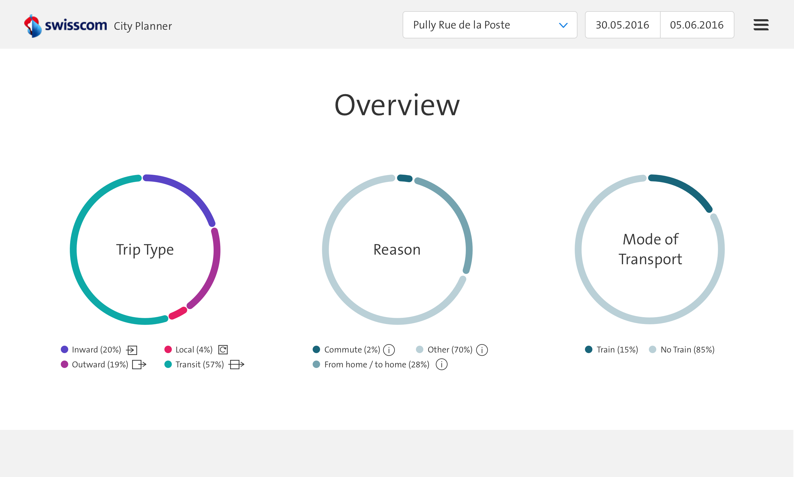
Trip type, reason and mode of transport
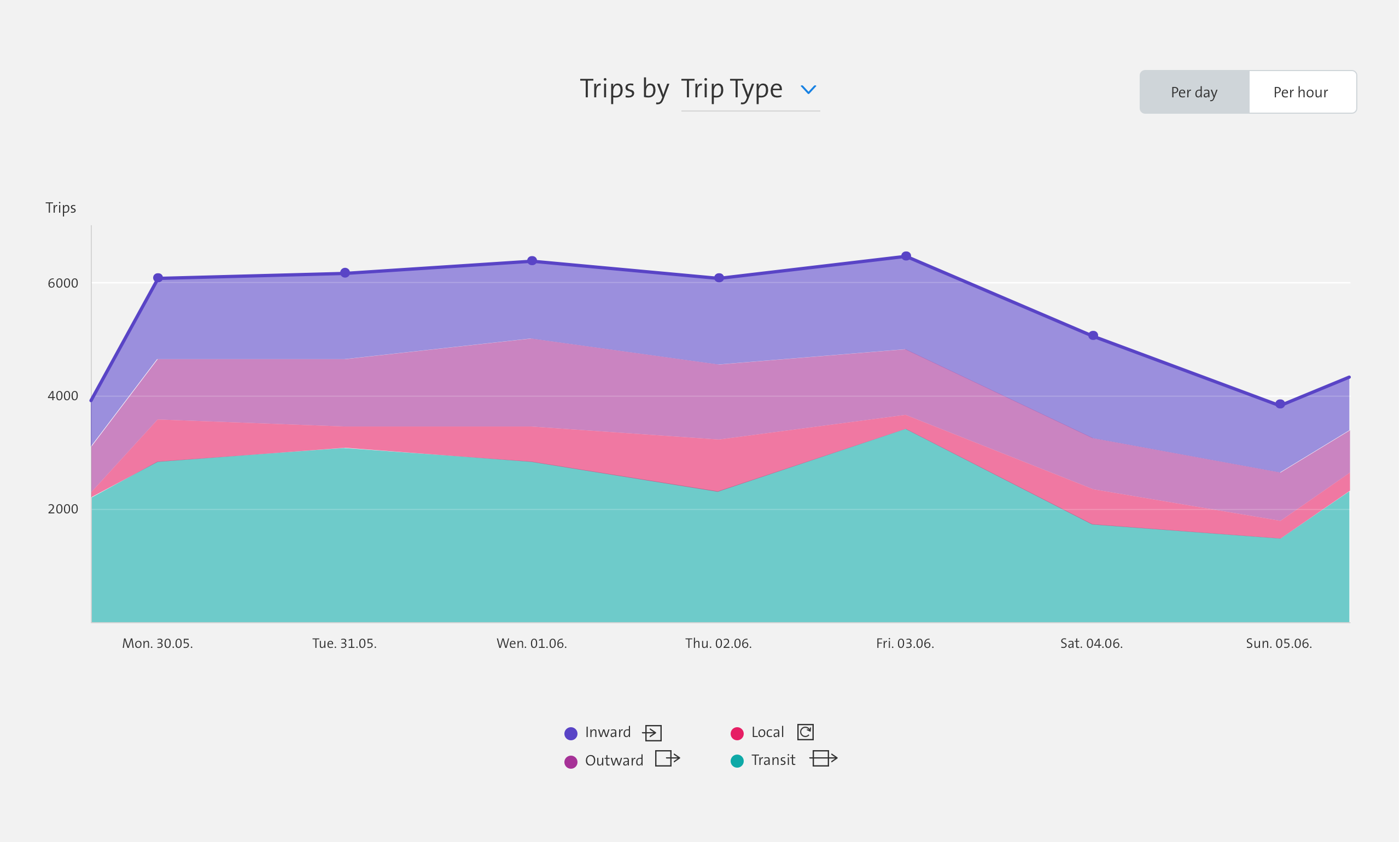
Trips by trip type
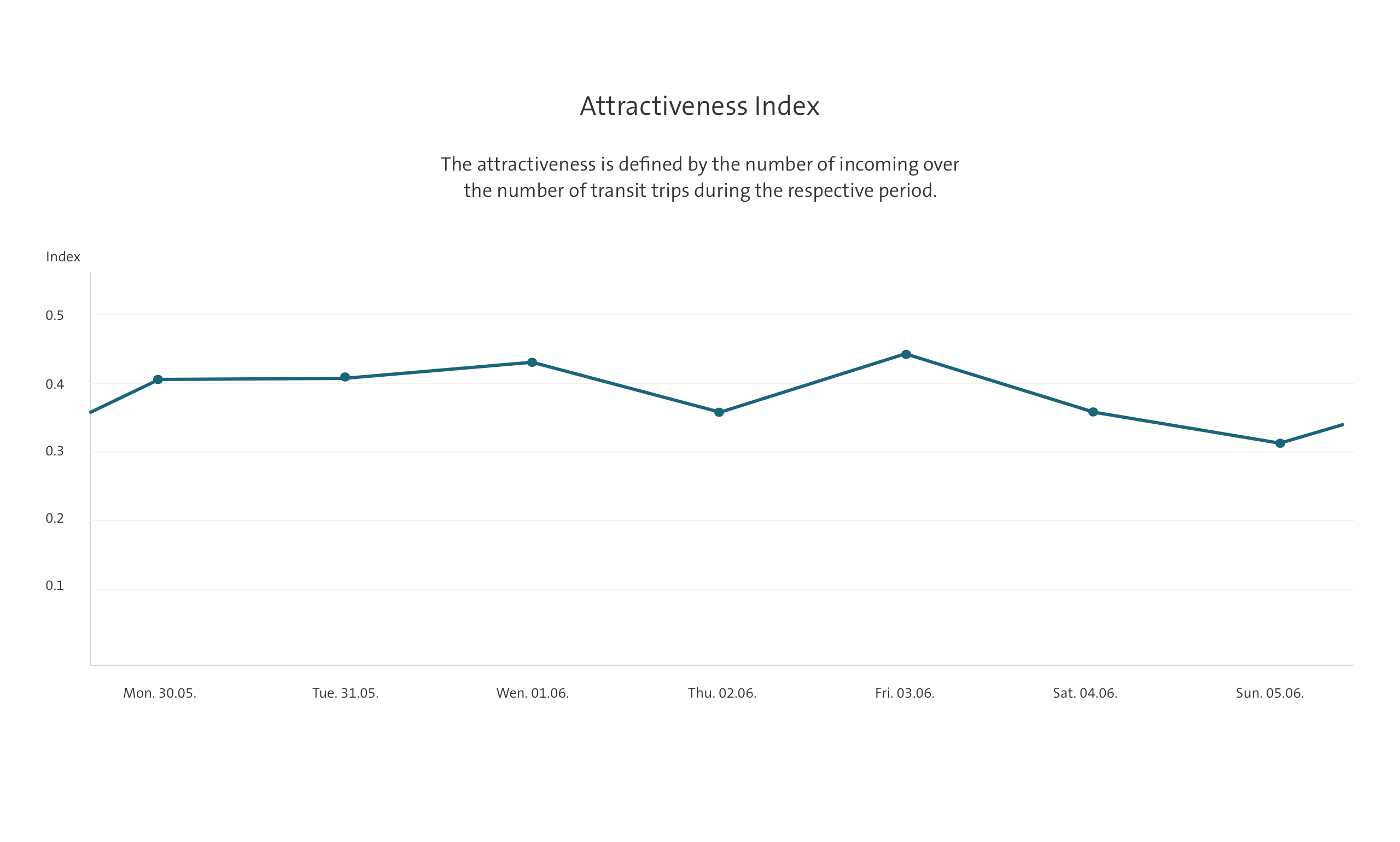
Attractiveness Index
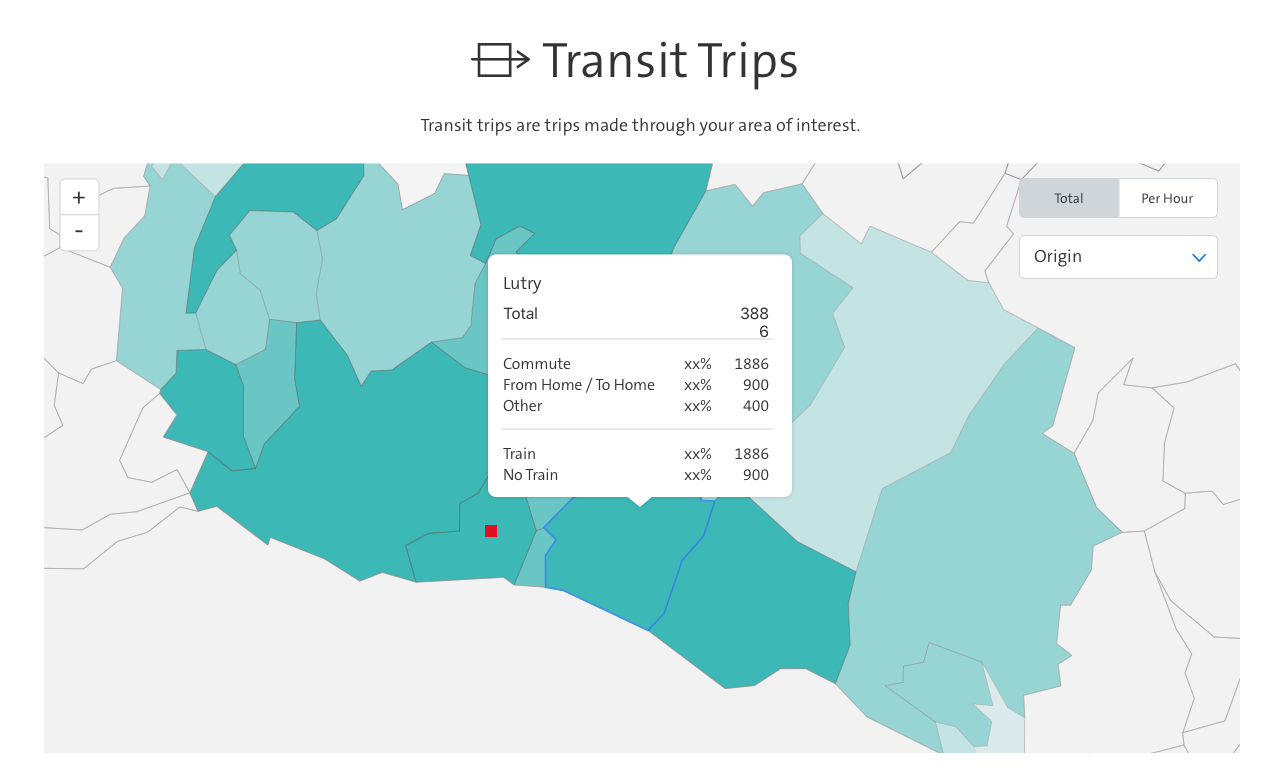
Map with detailed information on hover
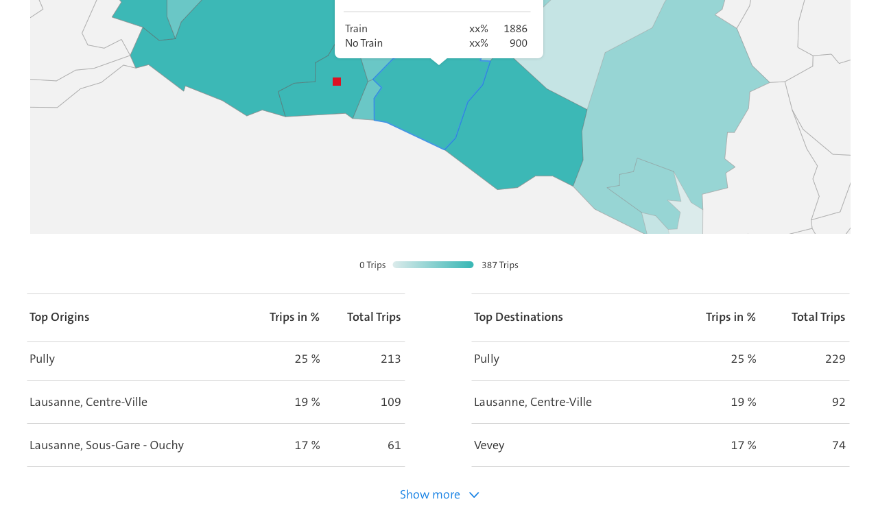
Top trips by origins and destinations
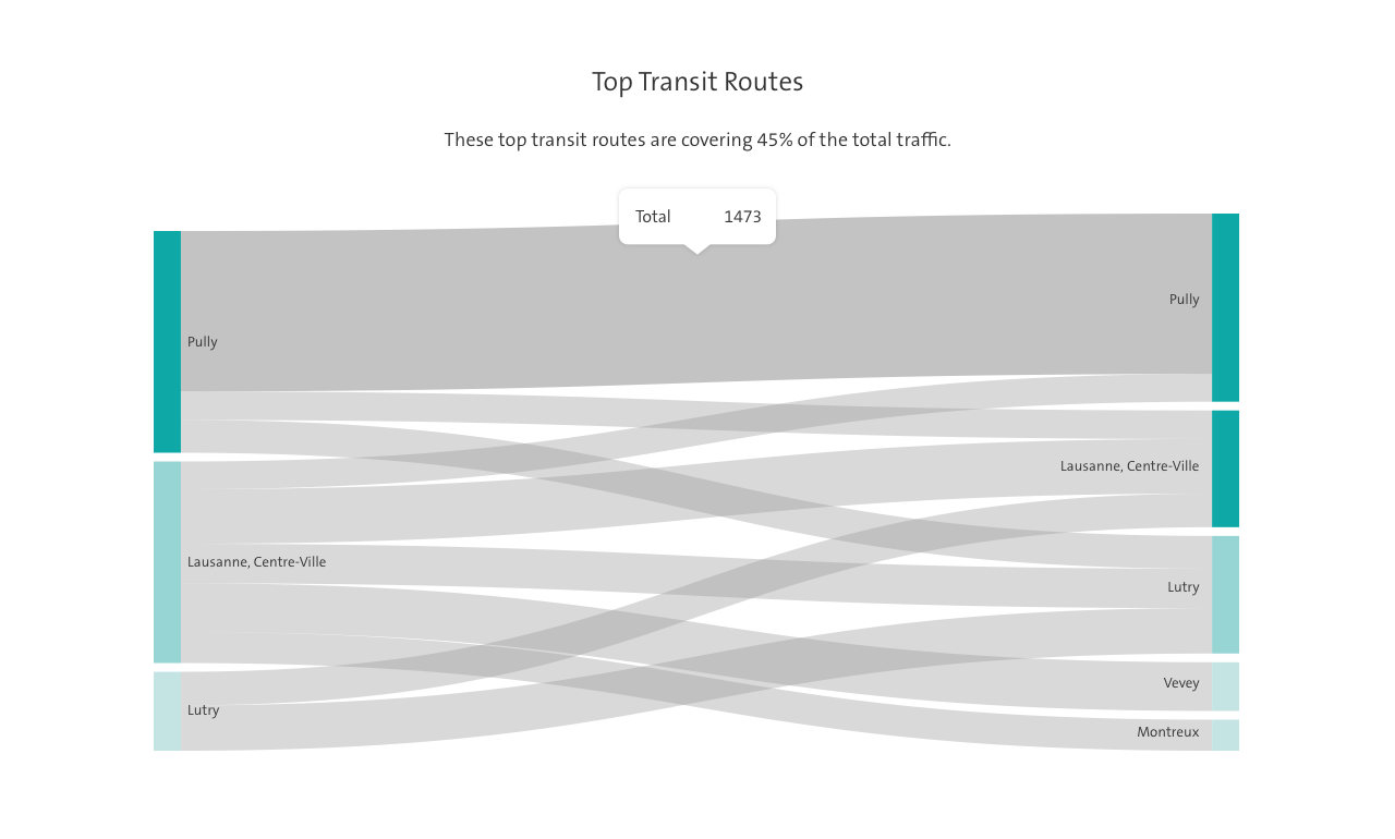
Top transit routes
In order to build a valuable tool for urban planners we needed to dive deep into the complex data they work with daily. Because of this, a key success factor for the project was a close collaboration between Ginetta, the pilot user group and the Swisscom City team.

Ilona Baier
Design

Sylvain Morger
User Research

Irene Hilber
Design

Melanie Kovacs
Client Partner