SBB Mobile
Every year, the Swiss Rail System (SBB) transports 366 million passengers — commuters, tourists, and weekend travelers alike. Designing a new mobile application for SBB means designing an app for everyone. And performing the follow-up act for Switzerland’s most downloaded app means vastly improving the shortcomings of the former app while maintaining the things we love about it.
In April of 2014 Olivier Cornet, head of SBB E-Business, approached Ginetta to rethink its mobile application, and we kicked off a project to redesign the SBB Mobile App. In just eight weeks, Ginetta created an interactive concept and visual design for the new application.
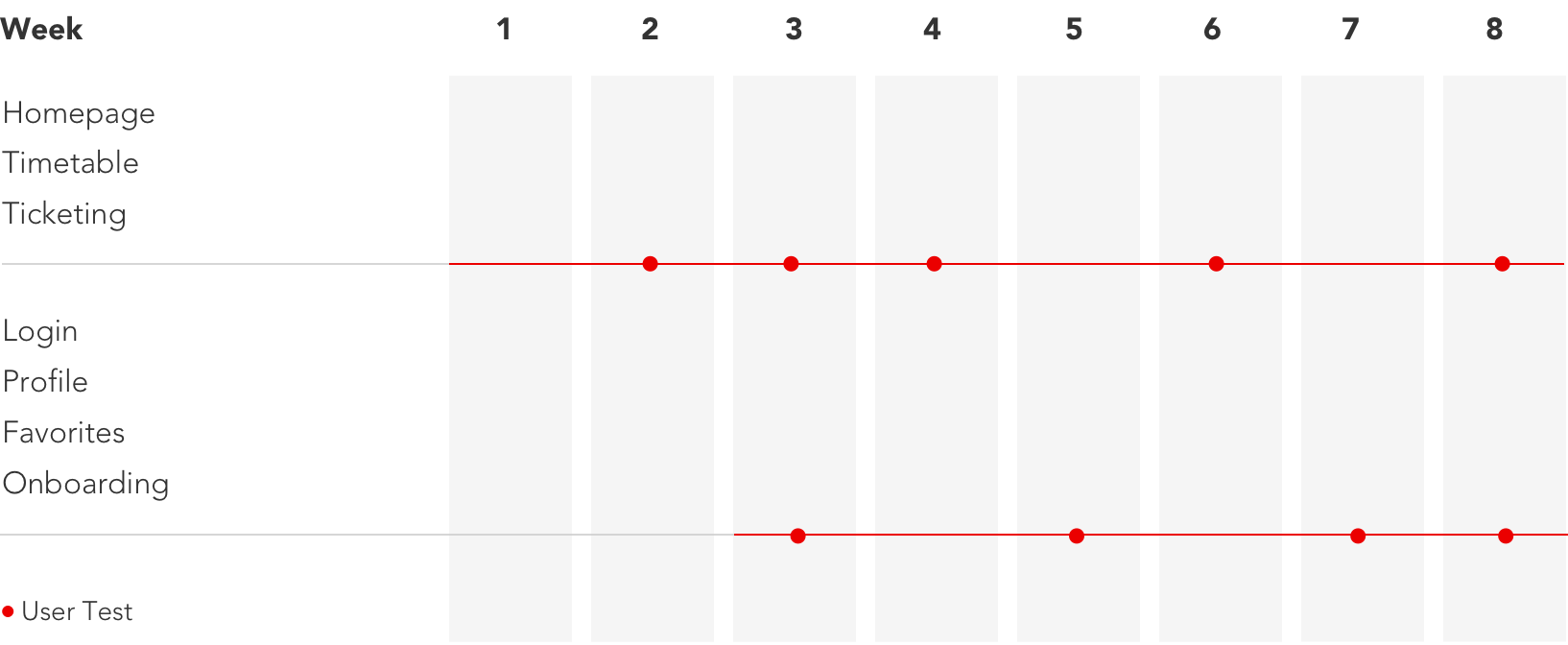
Ginetta continued to play an essential role in shaping the final product throughout the implementation phase. For eight months, we worked on location in Bern as part of the project team until the initial release of the product at its public preview in November of 2015.
How did we maintain focus on the overarching goals while designing the details and throughout the implementation phase? By defined guiding principles for our design:
The next step towards completing a task is obvious and anxiety-free. All roads lead to home.
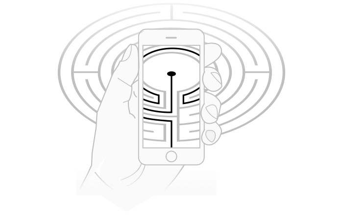
For a fast and frictionless travel experience, your application needs to have a brain.
Design a visual language that tells a story accessible to everyone regardless of age or ability.
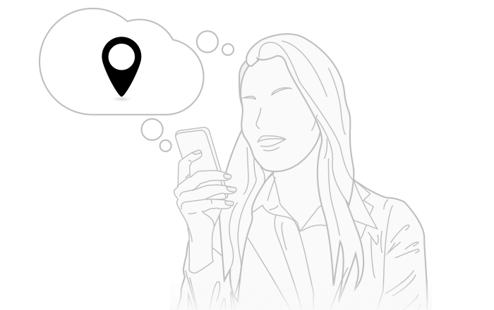
When and where does my train depart? Can I bring my bicycle? How much does a ticket cost? Are there disruptions to service?

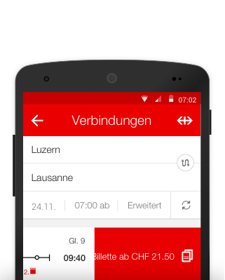
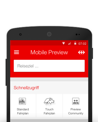
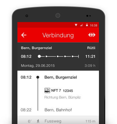
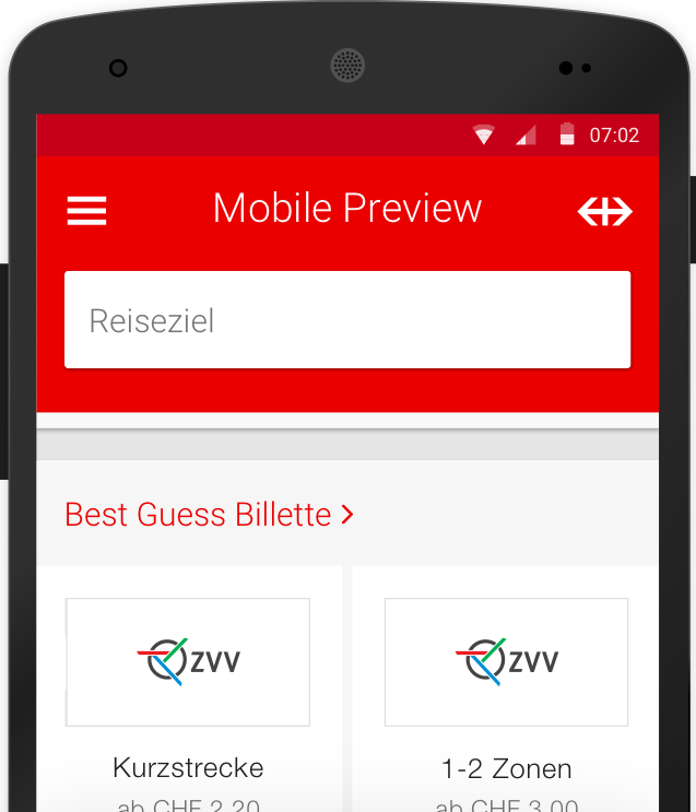
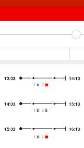
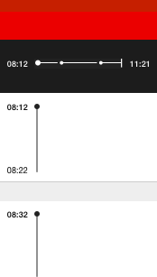
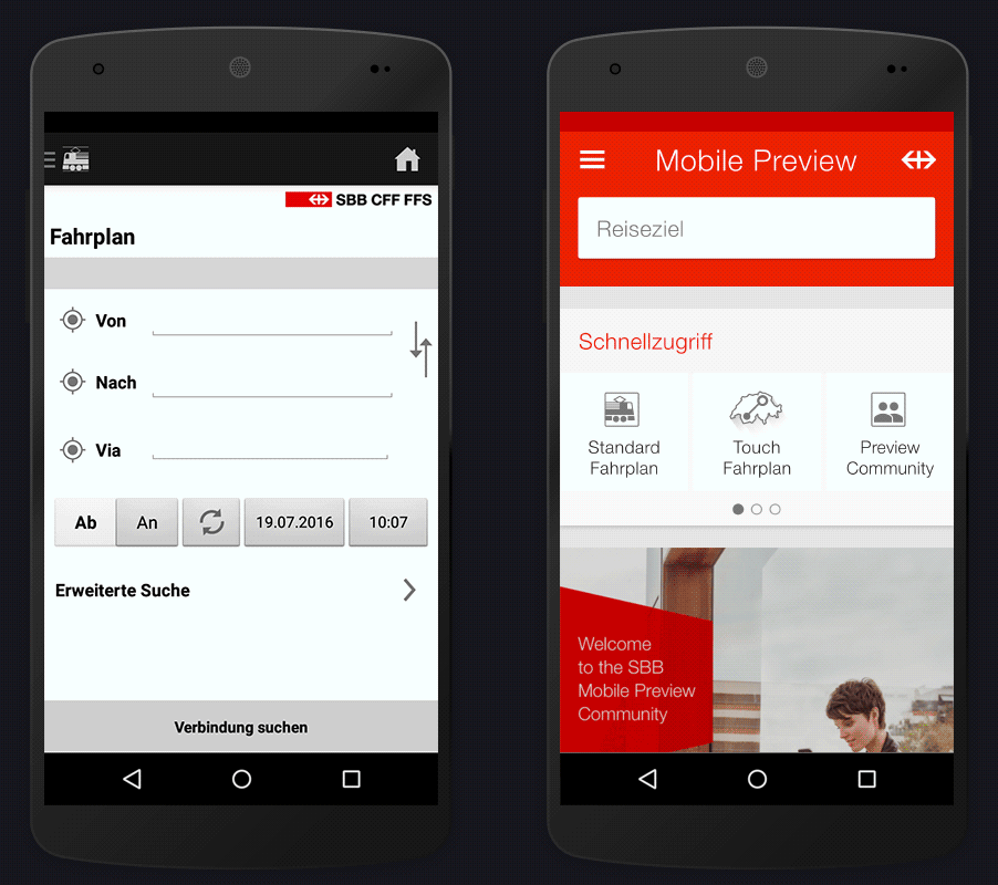
Whether a user would like to purchase a ticket or simply needs critical information about a route, the starting point is the same. From the homepage, users can quickly begin a search or jump directly to the desired content using a short cut. The transition from the search to the overview of possible connections is seamless and leads, in turn, to detailed information and ticketing options. Navigation is step-by-step. The user completes one task, returns home, and begins again. There is no hierarchy or multiple content categories, no need for a complicated off-canvas navigation or button bar.
Based on a user’s behavior and past purchases, the application displays content on the homepage that most likely meets the needs of a user at any given moment and location. They needn’t spend precious time “telling” the app what they prefer — the app simply learns and anticipates accordingly. Why is this relevant? Because less than 5% of users make the effort to change default settings.
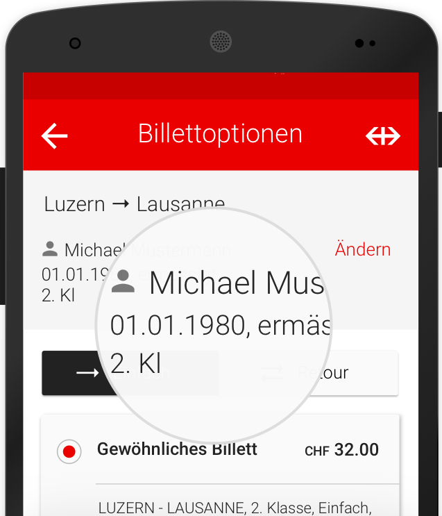
There are, however, personal parameters — GA or Halbtax, friends and family one frequently travels with, a home or work address — that the app cannot guess. Here the concept of persistence comes into play. Information a user enters and options they select, are remembered by the app for all subsequent purchases. Changes to personal information take immediate effect and persist until they are changed again.
Perhaps the biggest challenge designing an app like this one is that the target audience is, well: everyone. But what does it mean that we’re designing for everyone? It means we need a visual language.
A visual language is not unlike a spoken language. It follows some basic rules. A vocabulary of diverse forms such as lines, points, arrows, icons, textual information are combined with a syntax of color, typography and units of size create meaning in an interface.
A language needs to be simple enough that a user can learn it implicitly. Users should be able to infer what the rules are without learning them explicitly. There are a couple of ways to ensure that this happens: design consistency of interface elements and intelligent inconsistency where appropriate.
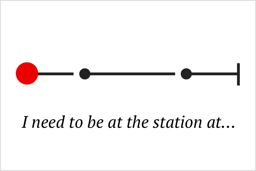
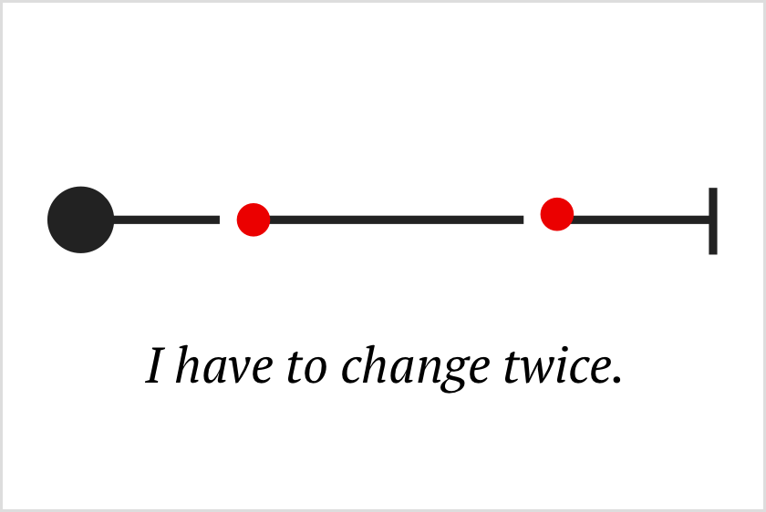
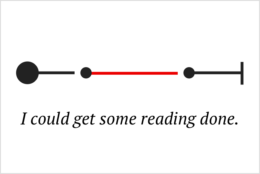
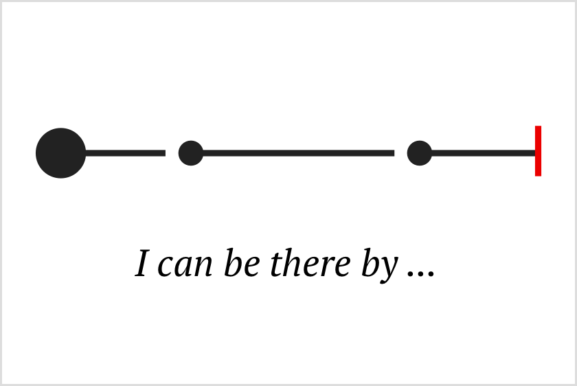
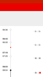
Language doesn’t exist for its own sake. It’s purpose is to communicate, to tell a story. And storytelling is about commanding someone’s attention. Visual hierarchy and data visualization allow us to deliver complex information in digestible tidbits, helping the user to imagine his or her own journey with its starting point, ending point, and potential changes in-between.
The result is a state-of-the-art mobile application design, adaptable for multiple platforms. The design takes advantage of modern patterns for interaction and provides users with a simple and consistent interface while clearly communicating the SBB brand.
Buying a ticket used to mean 11 taps and 50 seconds. In the new app, travellers reach the purchase screen in just two taps and 15 seconds.
At Ginetta, we champion the user’s perspective. We strive for perfection and discuss trade-offs like adults. Our job is to challenge the status quo with design thinking, then roll up our sleeves and follow through in the development phase, defending or adapting our design as the project requires. It takes skill, experience, and tenacity. And we’ve got those in spades.

Simon Raess
Strategy

Jessica Goodson
Design

Simone Reichlin
User Research

Florian Schulz
Design

Inês João
Design