PostFinance App


Money is a curious thing. Whether we have a lot or a little of it - we all have to deal with it. Some people love to invest and experiment with their money, others feel intimidated by the complex world of finance. PostFinance makes financial products accessible for everyone. The bank for every budget helps you to take care of your finances and build the future of your dreams: buy a home, travel the world, or enjoy your retirement in style. The new PostFinance app enables you to take control of your finances anytime and anywhere. Ginetta came up with an intuitive design that makes online banking feel effortless, easy, and safe.
The focus of the concept and design for the new app are people like you and me who use the app regularly to handle their daily finances. Therefore we had to break down the complex information architecture based on existing backend processes and make it work for their needs. All while walking the fine line between standardisation and diversity.
Another challenge when it comes to finances is safety. The goal was to create a design that is very intuitive and quick to use without making it feel too casual and compromising on safety.
I really appreciated working with Ginetta's design team. Together we have developed an aesthetic, first-class digital product in a user centered, focused and professional manner.
The app should be very intuitive so that everyone can use it with ease. And of course it should not stand as an isolated product but integrate seamlessly into the PostFinance world all while transporting the brands efficient & tangible vibe from the counter to the smartphone. We decided on three principles that guided the design.
Efficient
The banking process – from logging into the app to confirming a payment – should be effortless and easy while also making you feel safe.
Relevant
Instead of overwhelming people with a wide range of possible actions, we focused on the features that are used most often.
Modular
We wanted to enable PostFinance to scale the new digital experience over all channels.
For many of us every excuse is welcome to postpone the simplest financial tasks. The PostFinance app offers no excuses but makes e-banking on your phone as efficient as possible.
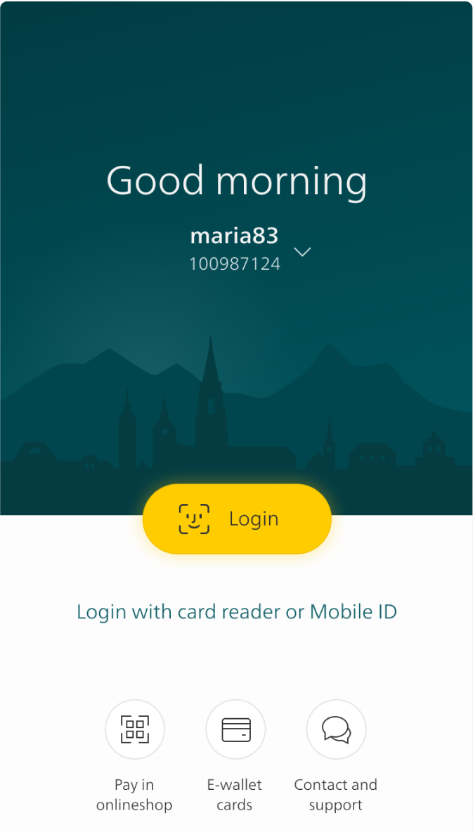
You can easily log in via fingerprint or face recognition. The home screen is very reduced and shows only the most relevant features that everyone uses on a daily basis: Balance of your bank account, payment and transfer functions, current transactions, and notifications.
The app should not only make banking more efficient but also come along in a fresh look and feel. The PostFinance brand should no longer be overly prominent but still recognizable. We stuck with the well known white and yellow as primary colors of action and also kept the slightly square buttons. As a novelty we introduced the color petrol. It is the predominant colour in the app and gives it a completely new look.
With the launch of IOS 13 with Dark Mode support this topic was an important part from the very beginning of the project. Dark Mode ensures that texts are pleasant to read even in the dark. Also, there are rumors that it makes your phone's battery last longer. To make the app more individual and recognizable we decided not to go with the usual black and white. Instead we used different shades of dark petrol. It picks up the primary color of the Light Mode and improves the readability. We also stuck with the trademark yellow which makes the brand even more recognizable.
To make the app more intuitive we used animations. This part of design is often perceived as icing on the cake to entertain the users. But we introduced it to the project from the very beginning as a way to guide people through the app and evoke feelings of safety or purpose.
This is how working and eventually banking is fun and we are proud of this fresh solution made for Switzerland.
There are loads of banking apps on the market. Some people say they are all the same but we are convinced that details in design make the difference. The new PostFinance app puts the people using it on the daily in the center. The simple and intuitive navigation and functions are tailored to their needs. As the management of personal finances increasingly happens on the go, the new app makes PostFinance stand out and stay recognizable in the jungle of app solutions. They offer their clients an easy way to not only stay on top of their finances but lay the foundation for realizing their dreams.

Jessica Müller
Concept & Design

Martin von Siebenthal
Concept & Design

Mara Hellstern
User Research

Nico Nydegger
Motion Design

Frank Salathé
Client Partner