Hilti Mobile Styleguide


Lack of design consistency is one of the most challenging parts of the UX process. A styleguide is a good way to solve this problem.
With an ongoing corporate level rebranding, Hilti asked Ginetta to collaborate with their internal User Interface Design team to build a styleguide for their mobile applications. Our close collaboration between their designers and our designers was key to the success of this project.
Hilti products are built with the construction professional in mind, and similarly, we wanted to build a styleguide with the digital designer in mind. Designers from different Hilti Business Units all over the world should be able to create a wide range of mobile applicationswith a consistent user experience.
We had three main challenges in this project.
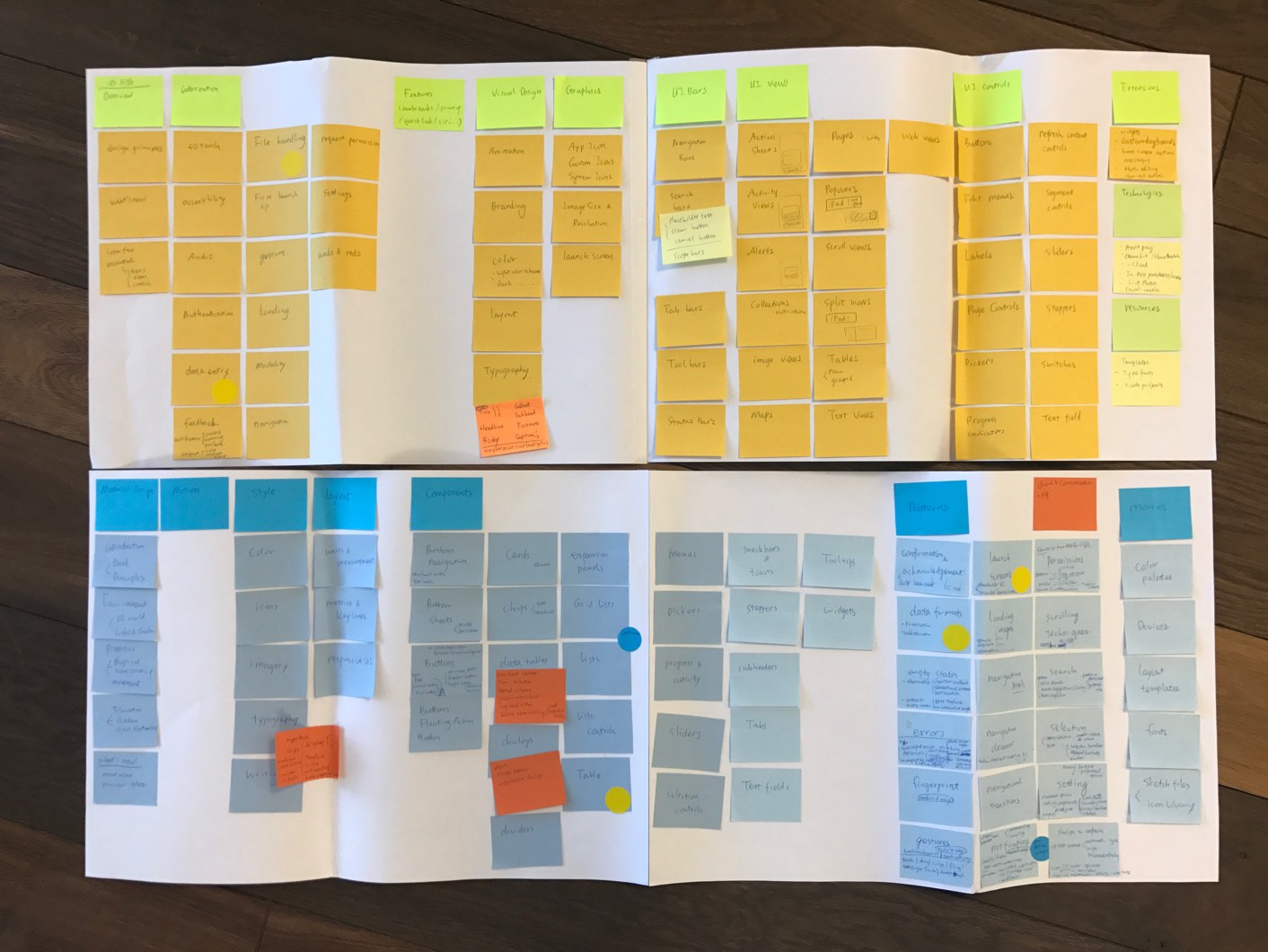
After a content audit of the existing products, how shall we prioritize the components to be included in the styleguide, and name and categorize them in a systematic way?
Taking the complexity of Hilti’s digital portfolio into consideration, what will be the new look of each component that is suitable and adaptable to different platforms and user groups?

What will the right container to document styleguide? Using a styleguide platform, building a new website, or something else?
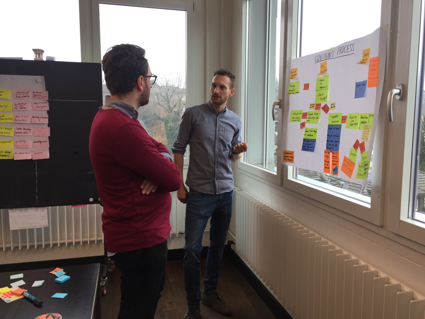
In order to tackle these design challenges, at Ginetta we follow a “Think-Make-Check” approach. The following example demonstrates how the “Check” process helps the entire project.
With Atomic Design as the methodology and Sketch (especially resizing and nested symbol features) as the tool, we experimented with how to integrate the styleguide directly into the tool designers work with.
Testing with real users helped us to shift the focus in time and to find new approaches to creating the mobile styleguide.
After one draft on a web-based platform, we tested with the designers. The clear pattern we discovered, was that once they downloaded the Sketch file source, they left the styleguide and hardly came back to check the rules and descriptions on it. A web-based styleguide is not optimal for a designer's workflow. Based on these findings, we shifted our focus and tried to turn the Sketch file itself into the styleguide.
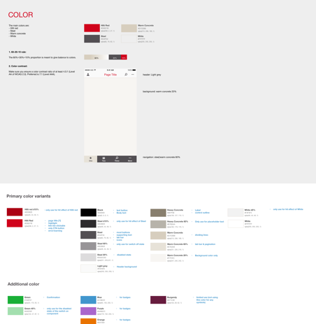
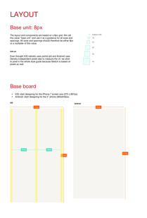
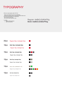
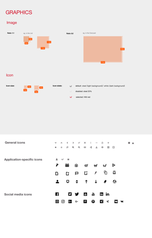
Our goal was to design a consistent and scalable system, not isolated components or screens. We divided the whole system into three layers: Foundation, Components and Pages. It also works as the structure of the styleguide.
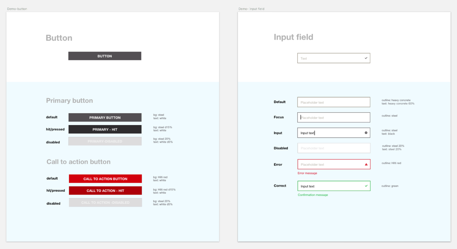
The first layer consists of Color, Typography, Graphics (including images and icons), and Layout.
Instead of further dividing into elements, modules or patterns, we simplify and remove the hierarchy between the raw material and the final pages. Buttons, Accordions, Checkbox, Header... all the ready-to-use stuff is put into the second layer and called “Components”.
We include several page templates to show how to combine components together.

We kept a close eye on the evolution of design tools. In November of 2016, Sketch launched the nested symbol feature. We tapped its potential right away in this project.
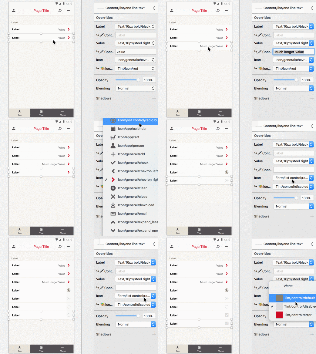
All the colors, text styles and icons are made into symbols and work as building blocks. By simply nesting them into the component symbols, they are reused over and over again in a repeated, scalable and consistent way. Now, the same color across all the icons, components and pages is leading to one color symbol, which is simple to manage and maintain. What’s more, the same component symbol can turn into all kinds of variables by simply switching the overrides.
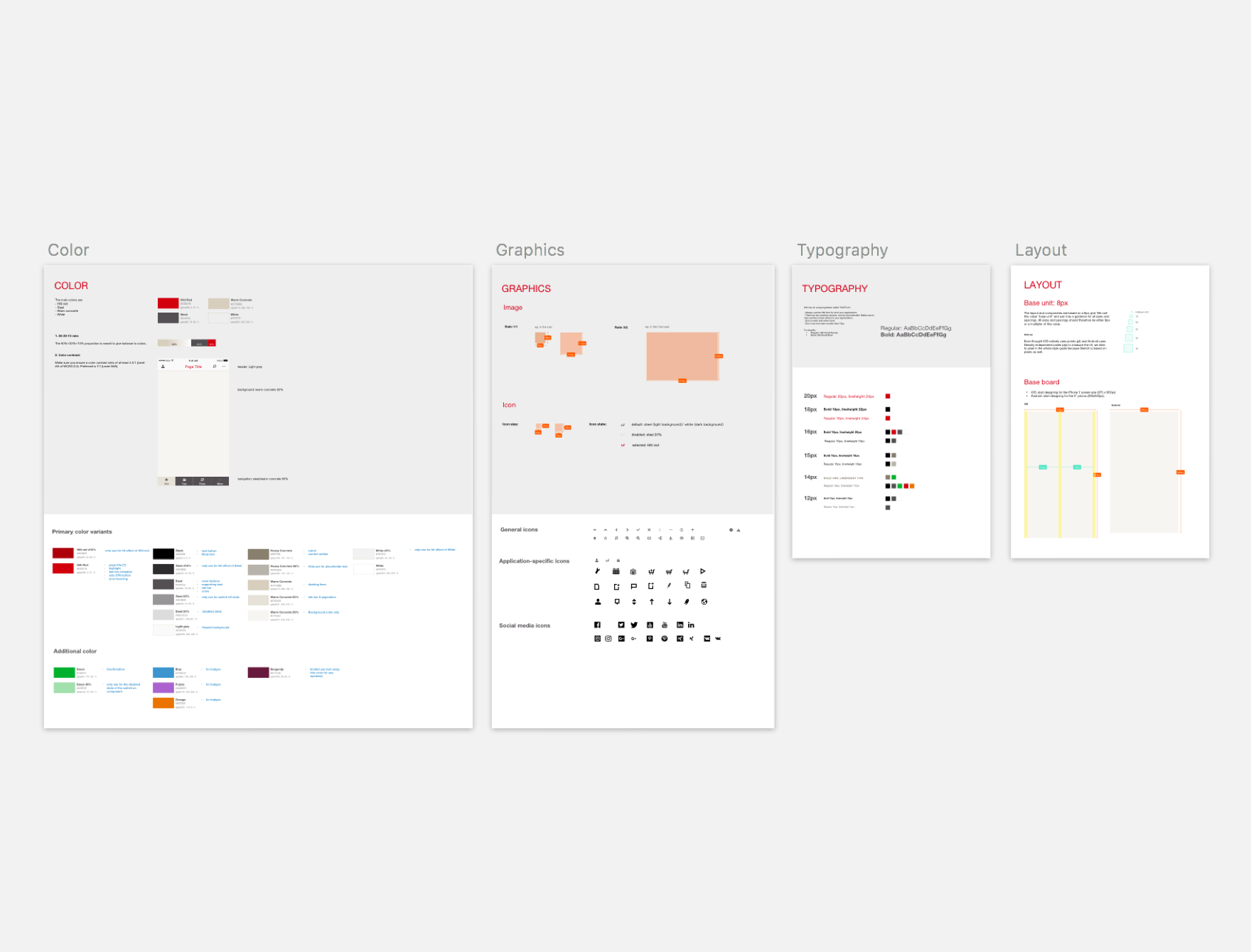
Foundation
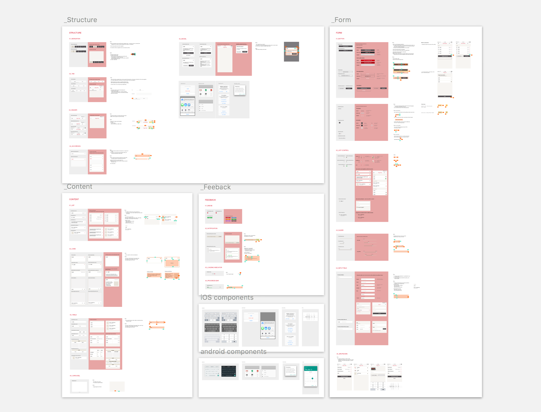
Components
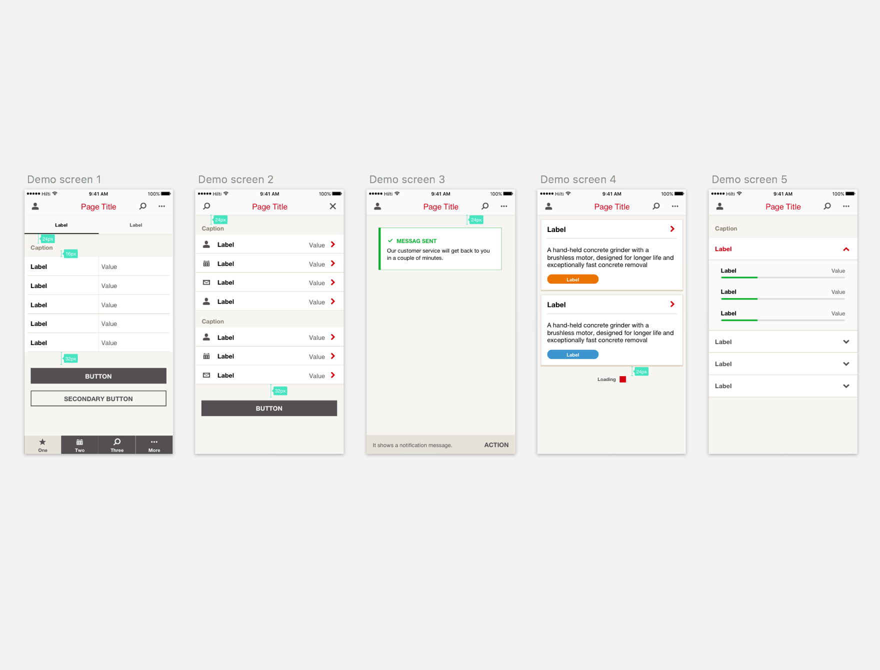
pages
Let’s keep evolving both the styleguide document and the approach

Min Chen
Interaction Designer

Stefan Pfister
Interaction Designer

Silva Skenderi-Brown
Client Partner