Helsana Premium Calculator
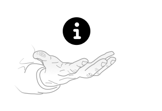
Helsana Group is the leading Swiss health insurance company. Its Premium Calculator is the core of Helsana's website. It helps the user understand insurance better and supports consumer decision-making. The launch of the calculator resulted in 31% more policies sold online.
Online consultation is intended to strengthen the online channel in direct sales, speed-up and digitalize processes, and provide a better structured customer service. In a first scope meeting with the client, we identified 3 main goals:
Learn and fully understand the benefits and constraints of specific products and offerings to make better choices

Select products that cater exactly to your specific needs and personal preferences
Buy insurance with more confidence, faster, and with less paperwork
In the concept phase and during interviews, we received insight on user needs and painpoints. We identified 2 major usability issues:
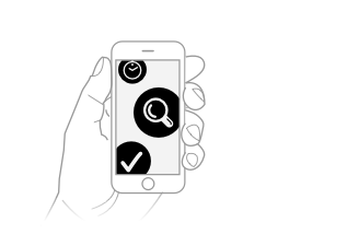
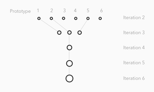
The design process was carried out in 7 sprints. In each two-week sprint we concretized the designs in the form of a clickable prototype. These prototypes were tested with users from the target group. The insights were taken into the next sprint.
Every sprint started with a kickoff workshop with all project members. Through this collaborative approach, we could profit from all the expertise - insurance knowledge, knowledge of customers and design expertise. On the basis of existing knowledge, gained from studies and surveys, we created 3 hypothetical personas. The motives, goals, needs and expectations of these personas were validated with potential users.
In the first interface sprint we worked out the specific requirements from the previously defined scope. This we translated in rudimentary screenflows, content elements, page layout and interaction patterns. The outcome was 6 potential ideas.
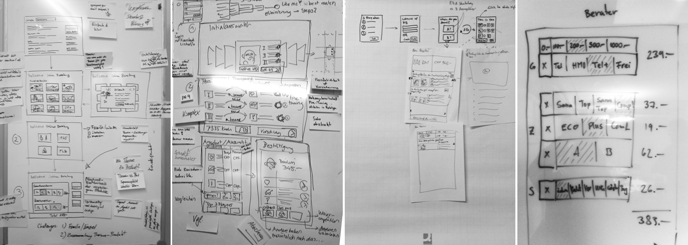
These ideas were translated into clickable prototypes and tested with users from the target group. In the following sprint we continued working on the prototypes that performed best. The insights of the test were taken into the next sprint and helped to concretize the design.
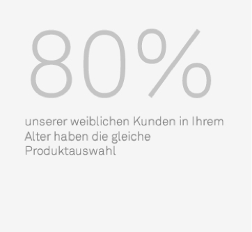
The integration of infographics and “best practices” didn’t perform very well. Although all users perceived this information as useful, they wanted to be treated individually instead of having an average offer.
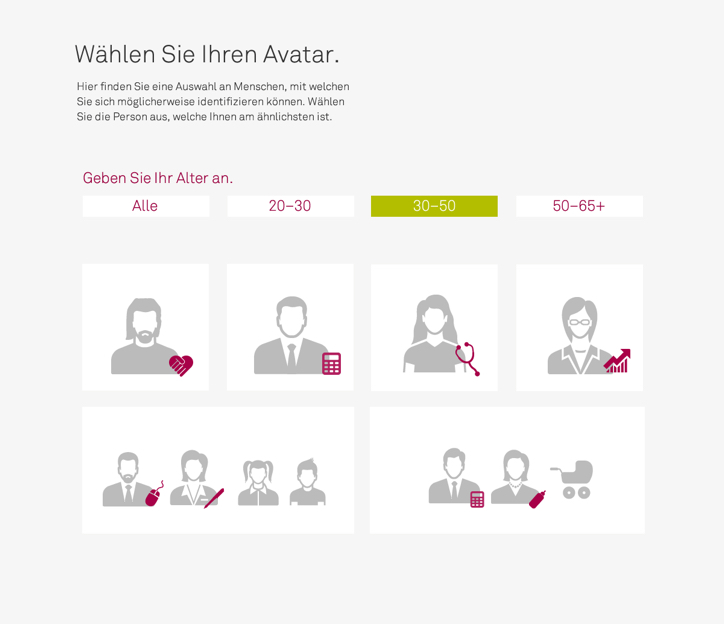
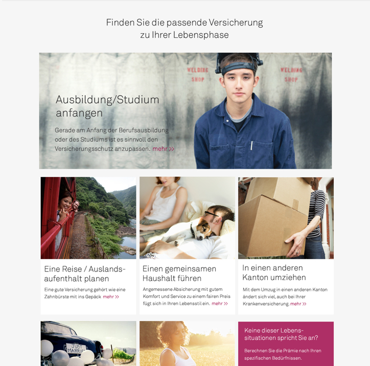
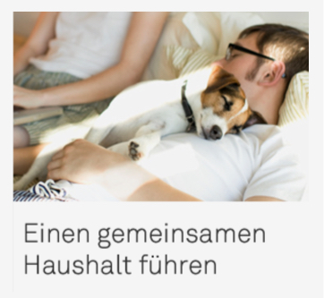
In the beginning we used emotionally rich imagery to strenghten the emotional engagement. Test participants perceived these images as advertising. Instead of using pictures we enriched the text with icons and illustrations.
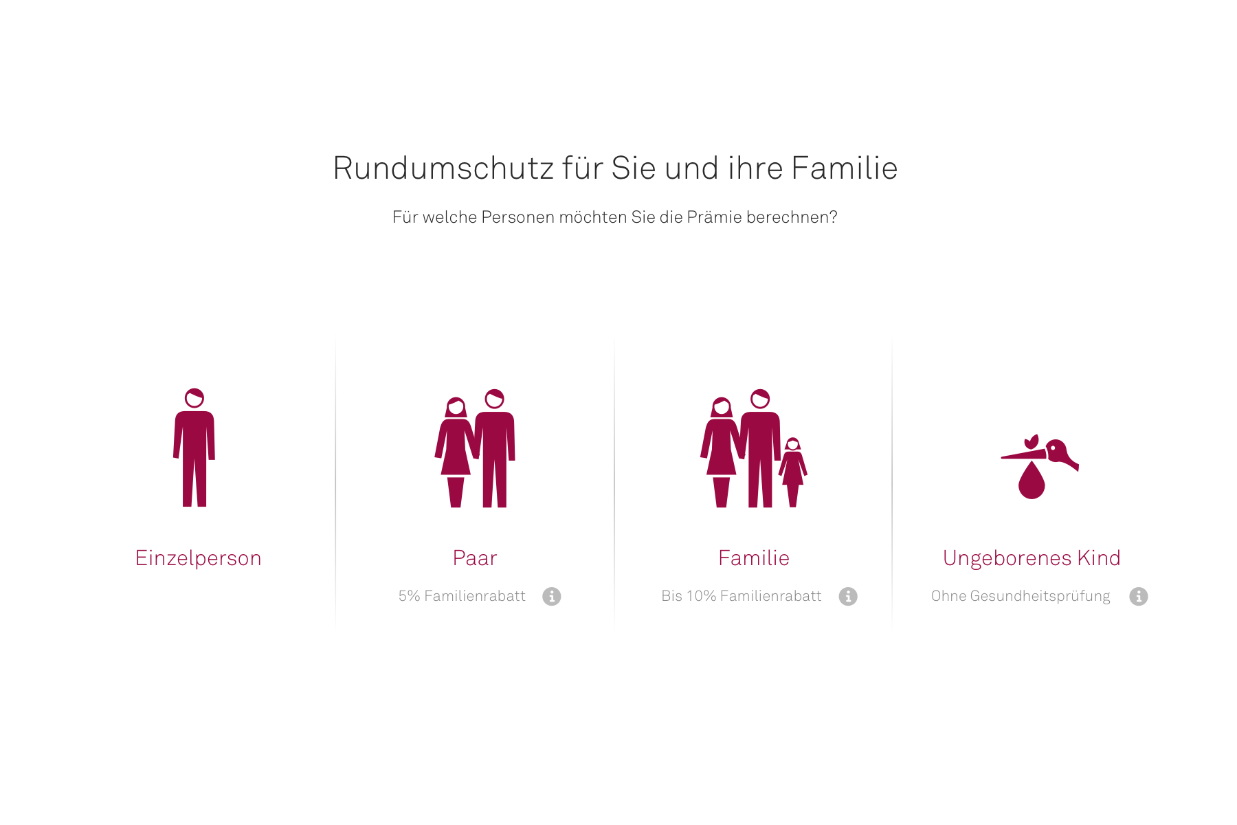
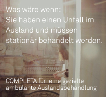
We tried to use push content to create awareness for coverage gaps. This was perceived as skeptical to the user. To generate the user's interest in products, we decided to provide this information only on demand.
We have developed a solution for Helsana that set a new benchmark in Switzerland within a year. It was copied by a handful of competitors in the next two years.
Competitors copied the whole flow almost 1:1 which made us proud of our work with Helsana. After all, imitation is the sincerest form of flattery.
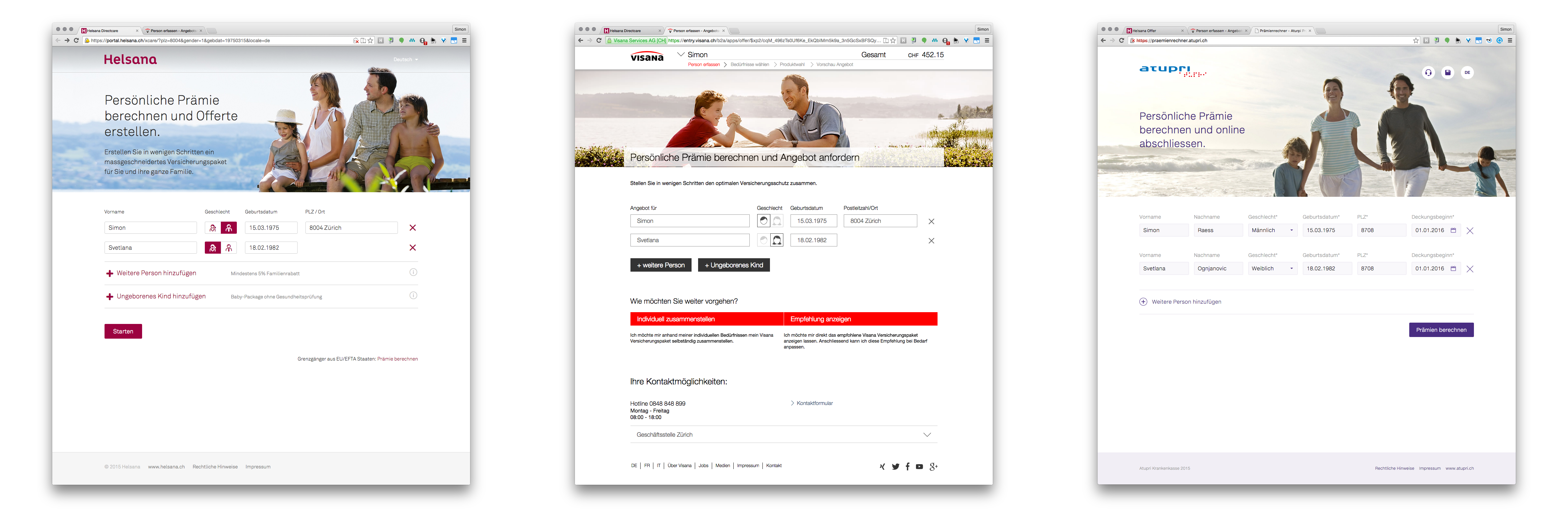
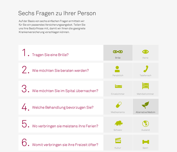
Step 1: Enter data
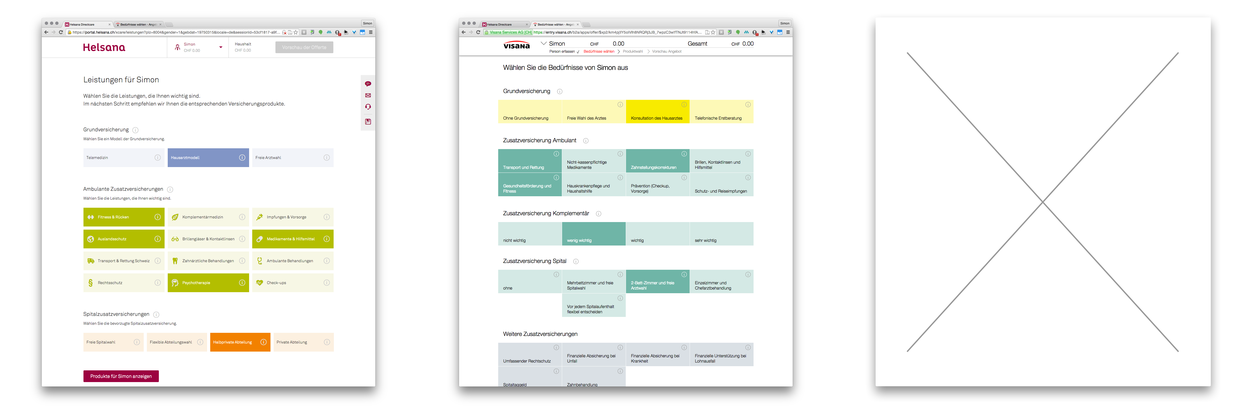
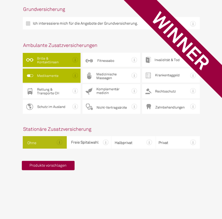
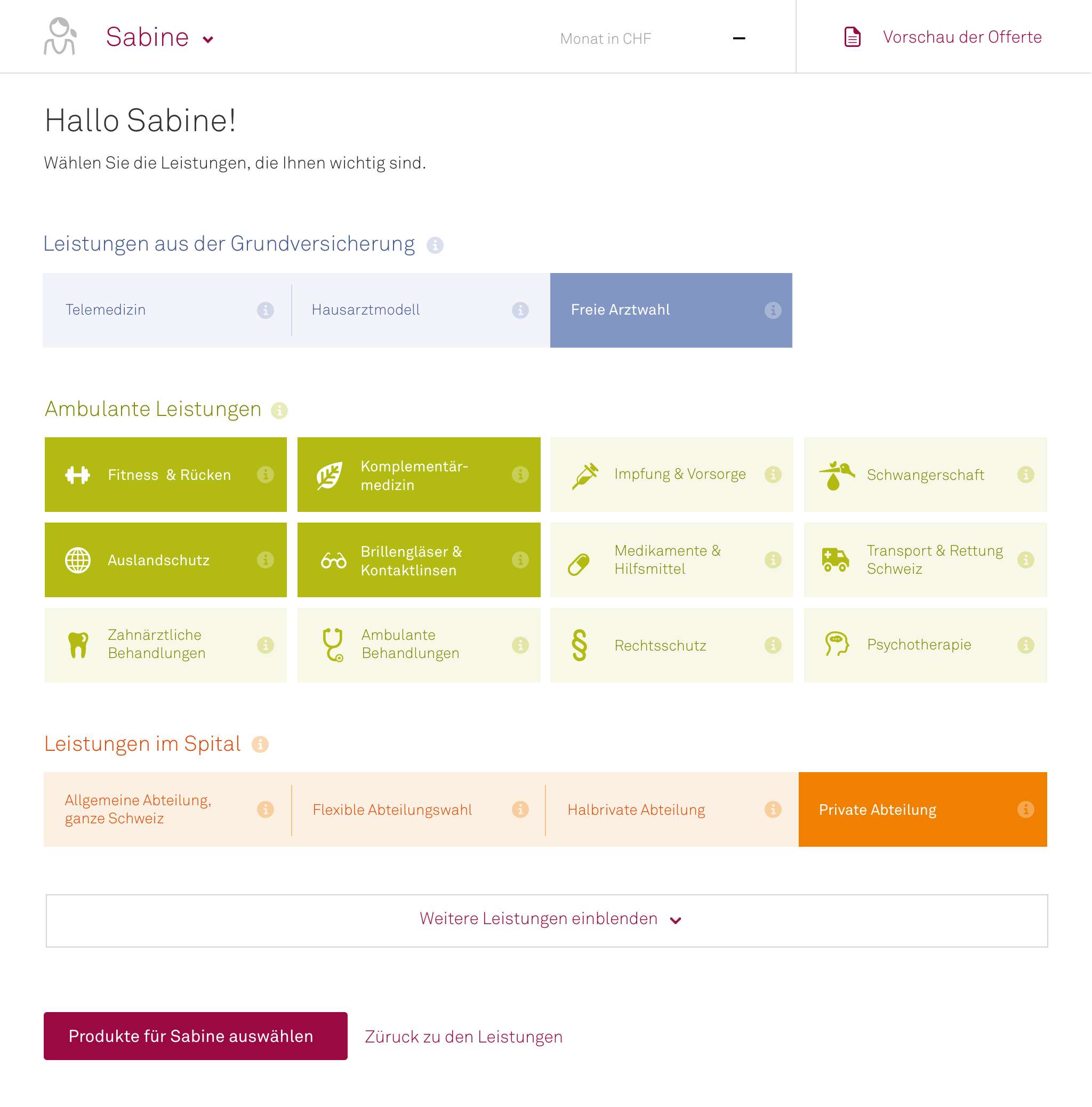
Step 2: Select benefits
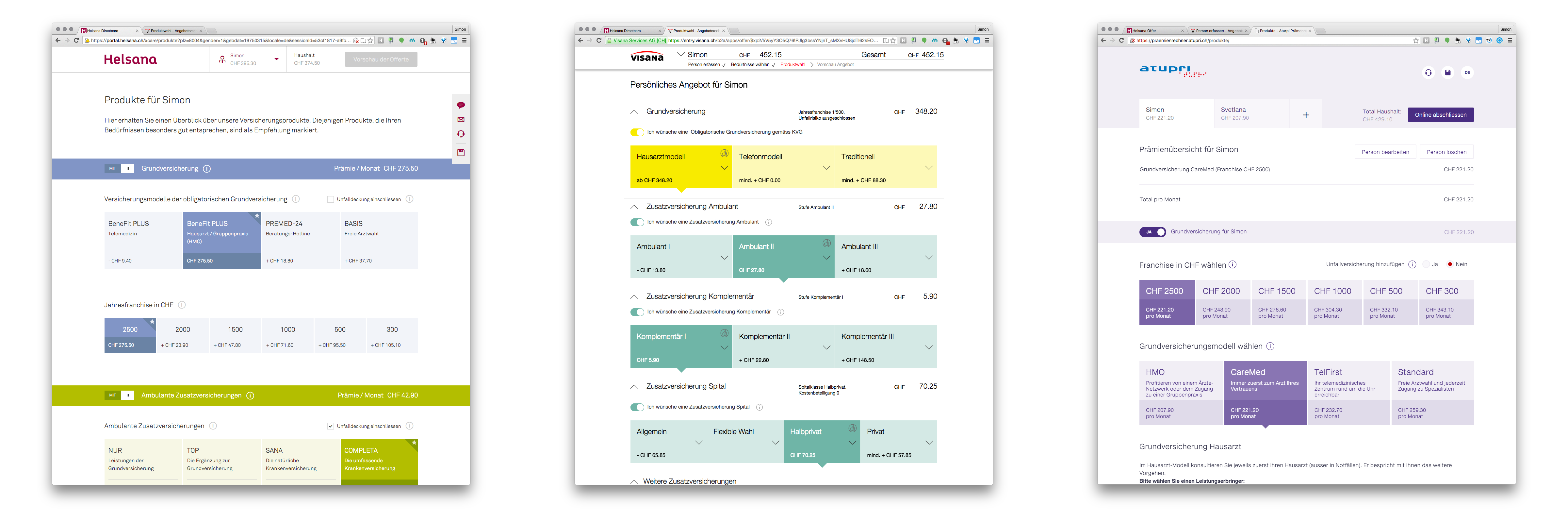
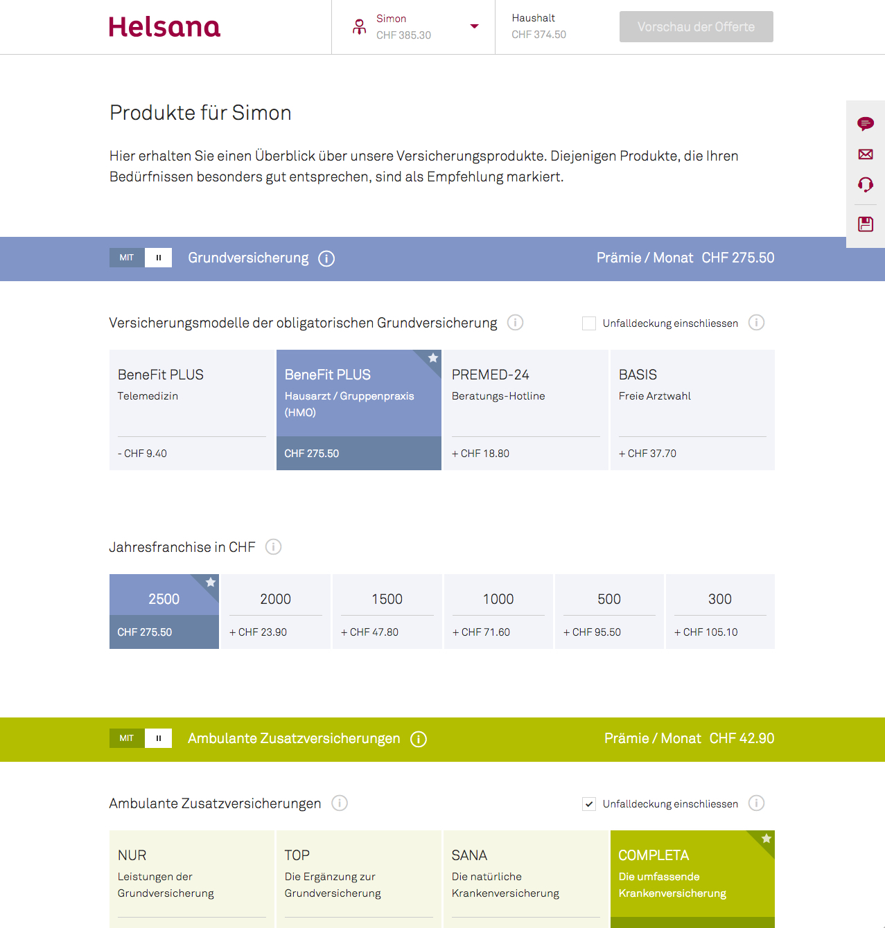
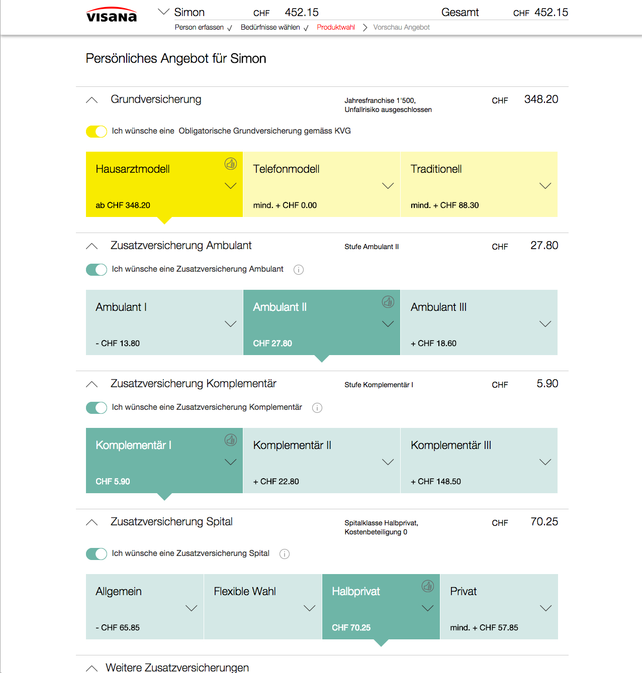
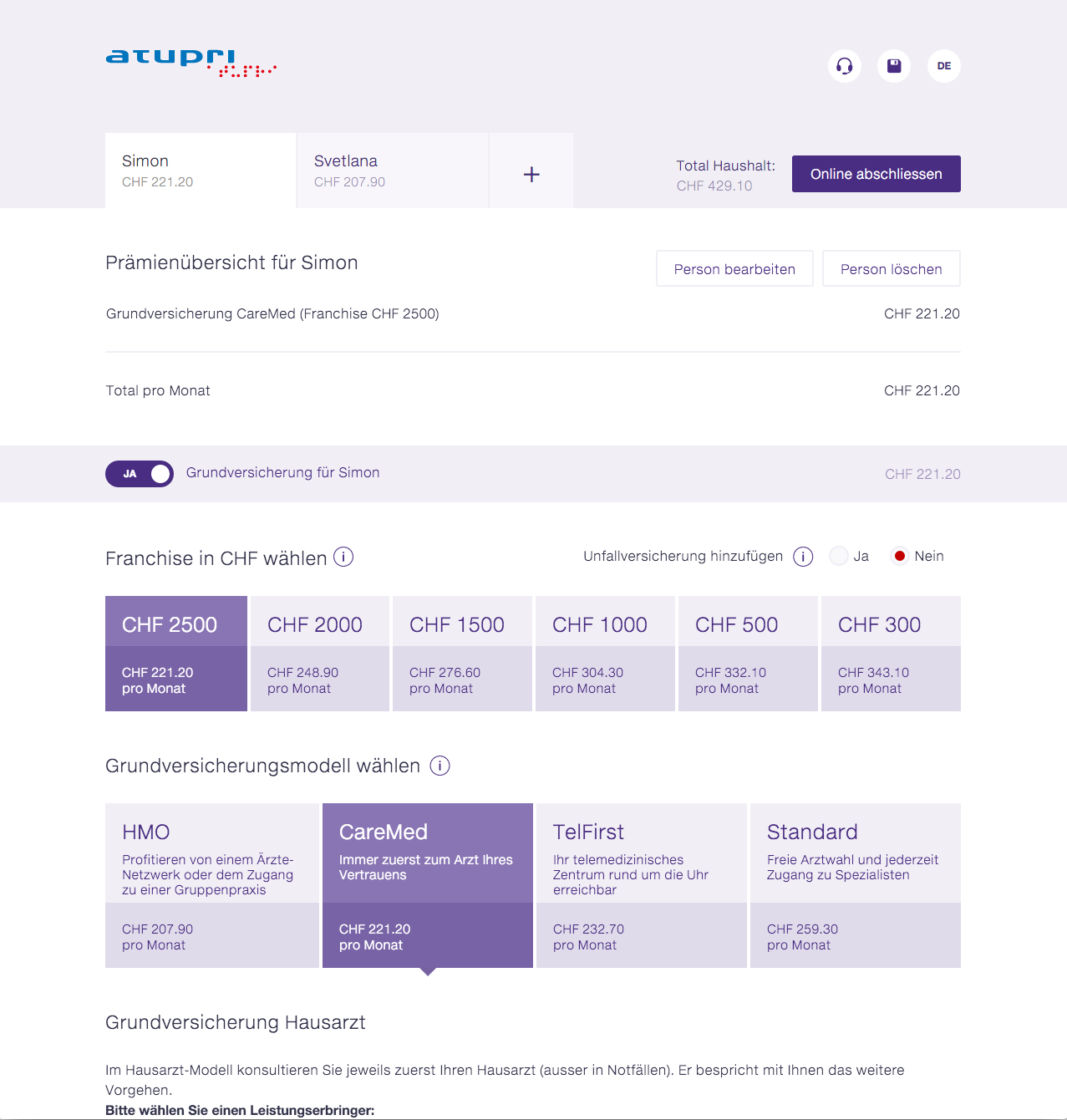
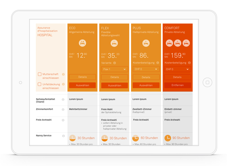
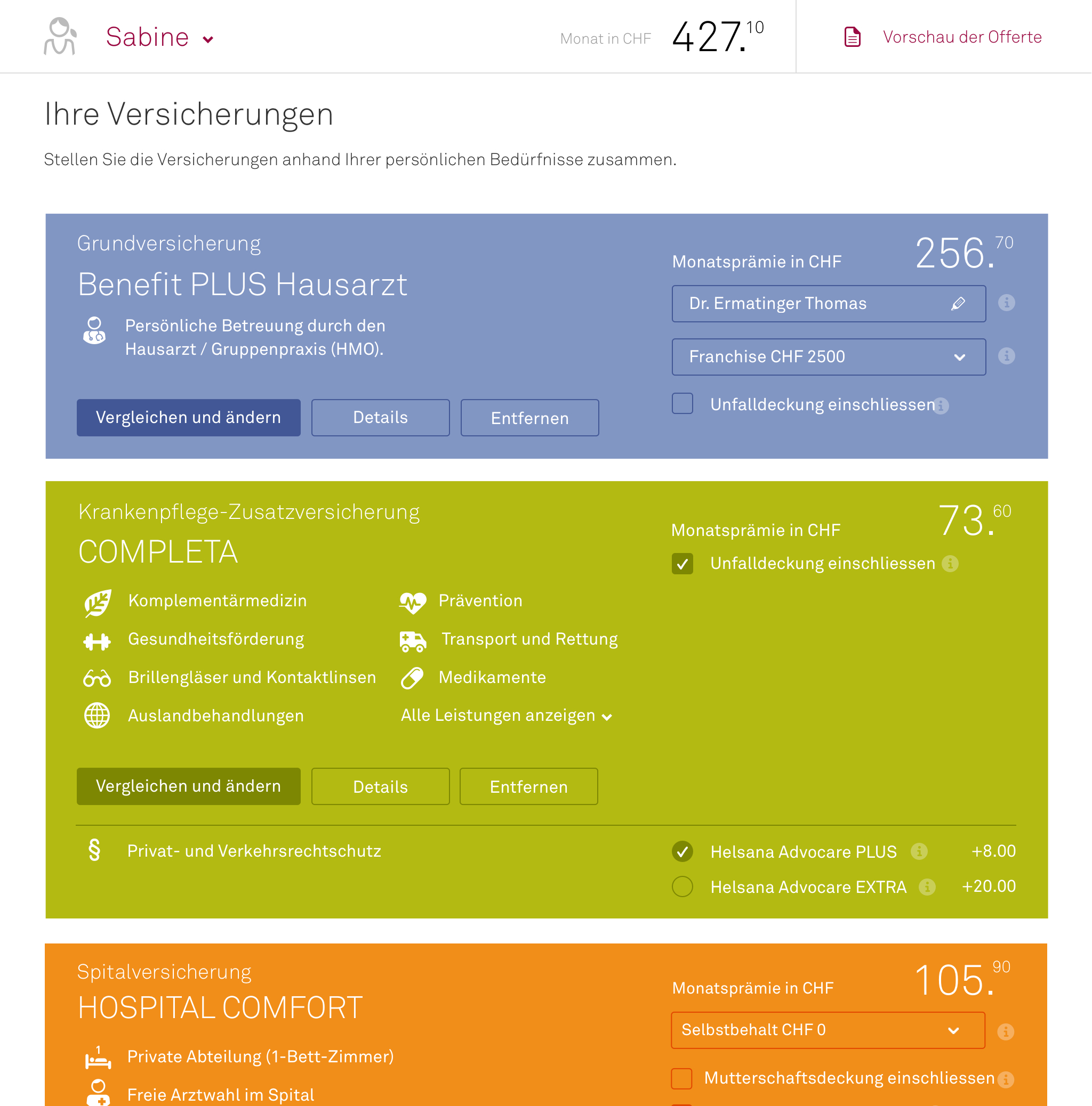
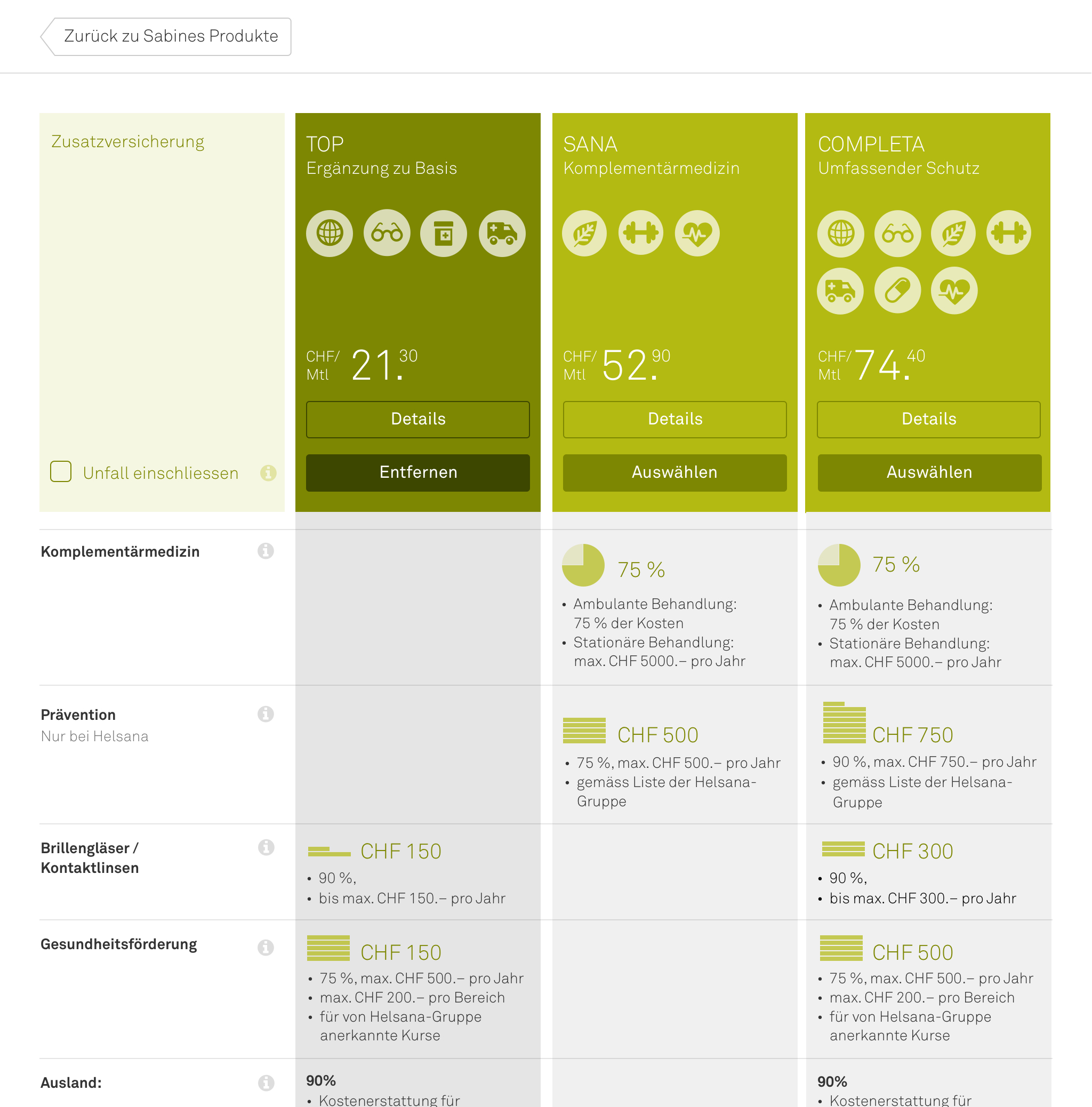
Step 3: Select products
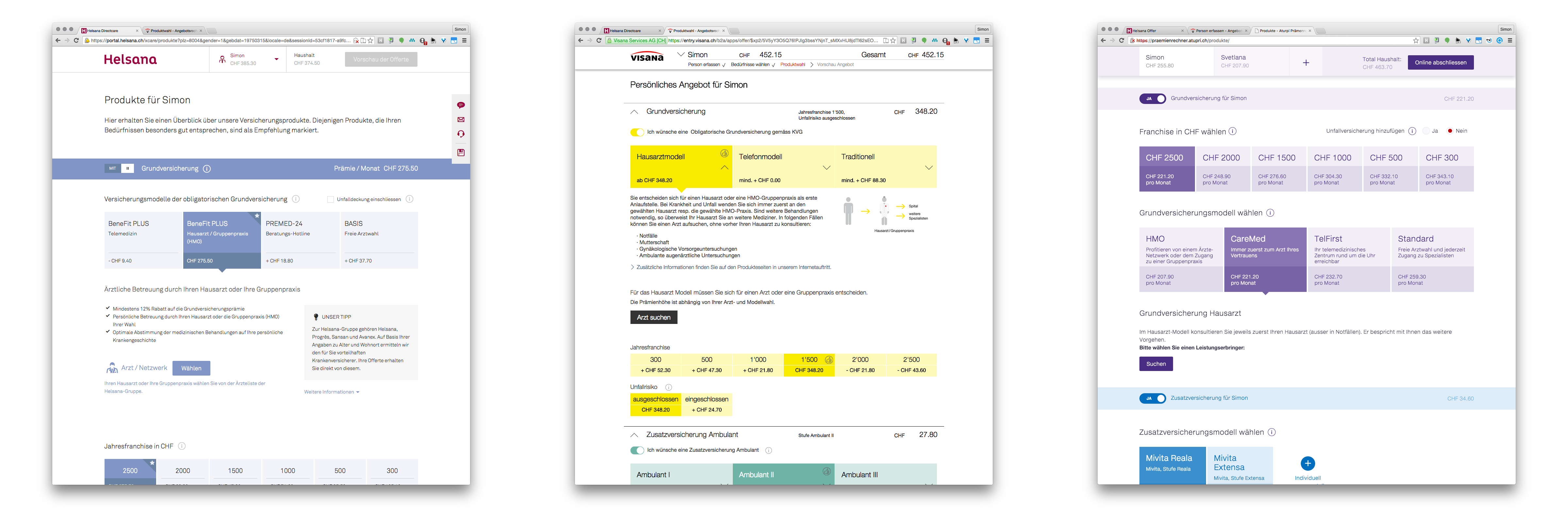
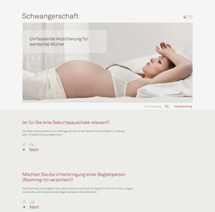
Step 4: Product detail
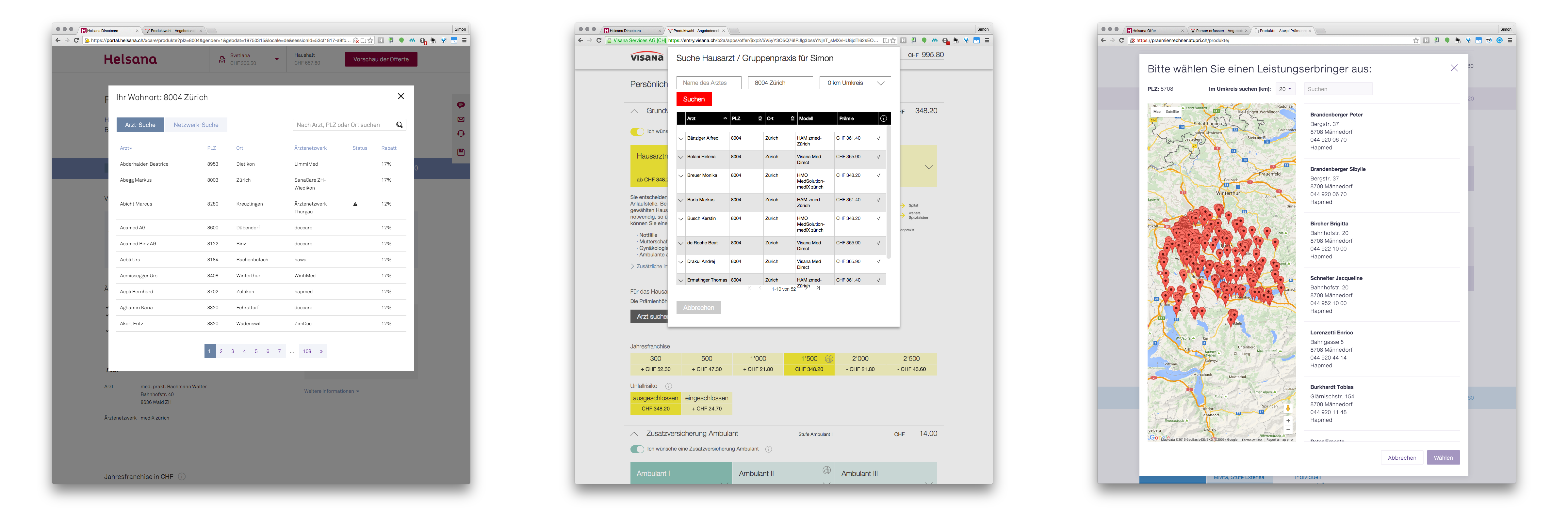
Step 5: Select doctor
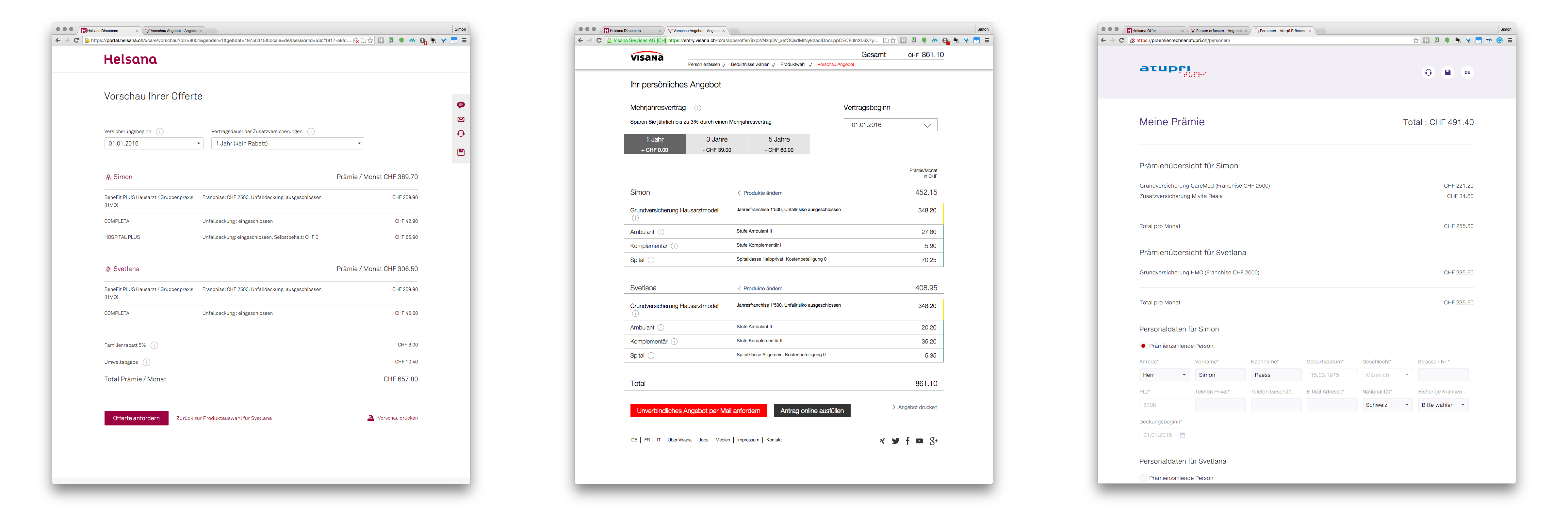
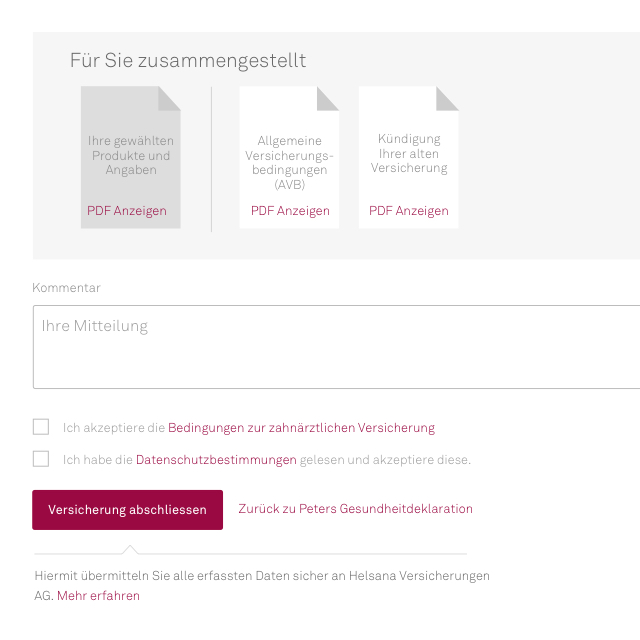
Step 6: Selection summary
The work of Ginetta is distinguished by a clear design language, creativity and high commitment. Ginetta combines visual appeal with clear guidance for the user.
In the same year as the launch, we already iterated and optimized again, so our client Helsana stays one step ahead.
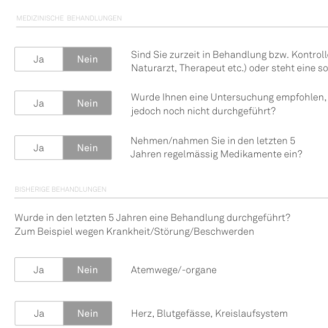
The tests showed that on an abstract level, customers know what benefits they want and need from insurance.
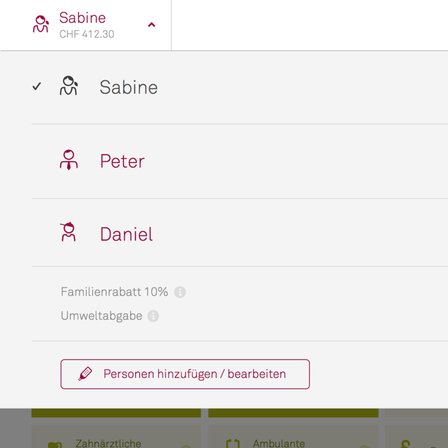
Based on the previously selected benefits we can propose the optimal products that fit the individual needs.
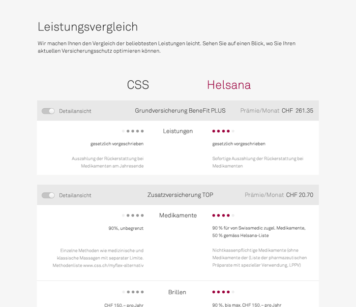
The product details are optimised so that users can evaluate the advantages (and disadvantages) of a product and compare them.
Among other improvements we introduced three important innovations:
Validating our design with real users was essential to achieving our goals with an intangible product like insurance. But the iterative process was not enough. Collaborating with the internal team at Helsana was key to expanding our domain knowledge and providing customers with a delightful experience.

Simon Raess
Design Strategy

Angela Dannhorn
Interaction Design

Tibor Kranjc
Interaction Design

Simone Reichlin
UX Research

Marvin-Sebastian Karácsony
Client Partner