Endress+Hauser
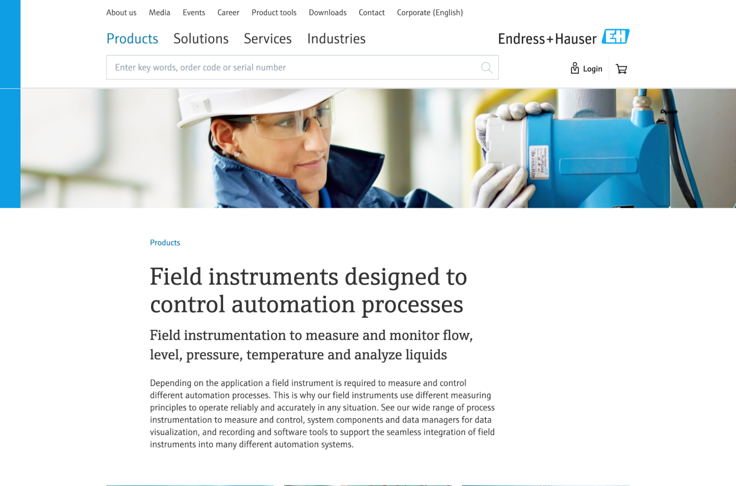

Endress+Hauser is an international process engineering company based in Basel, Switzerland, with more than 14,300 employees all over the world. As a leading company in their trade, they develop measuring instruments and provide services for numerous industries. The distribution of their products is increasingly handled through their website, where customers can order products, get quotes and also gain insights about the Endress+Hauser services and solutions.
Ginetta initially teamed up with Endress+Hauser to create a freshly polished responsive website with a simplified structure. Starting out as a single project-based collaboration, it has developed into a fruitful long-term partnership with various successful projects and team set-ups.
One of the first projects we were able to finalize with Endress+Hauser was a restructuring of their website in order to make it fully responsive. We focused on maintaining our usual user-centered process, so we first developed a strong understanding of the company's environment and services and then worked closely with the client. We organized the project in two-week sprints and tested our concepts and prototypes with real customers during each sprint.
Here are some of the challenges we encountered while working on the project:
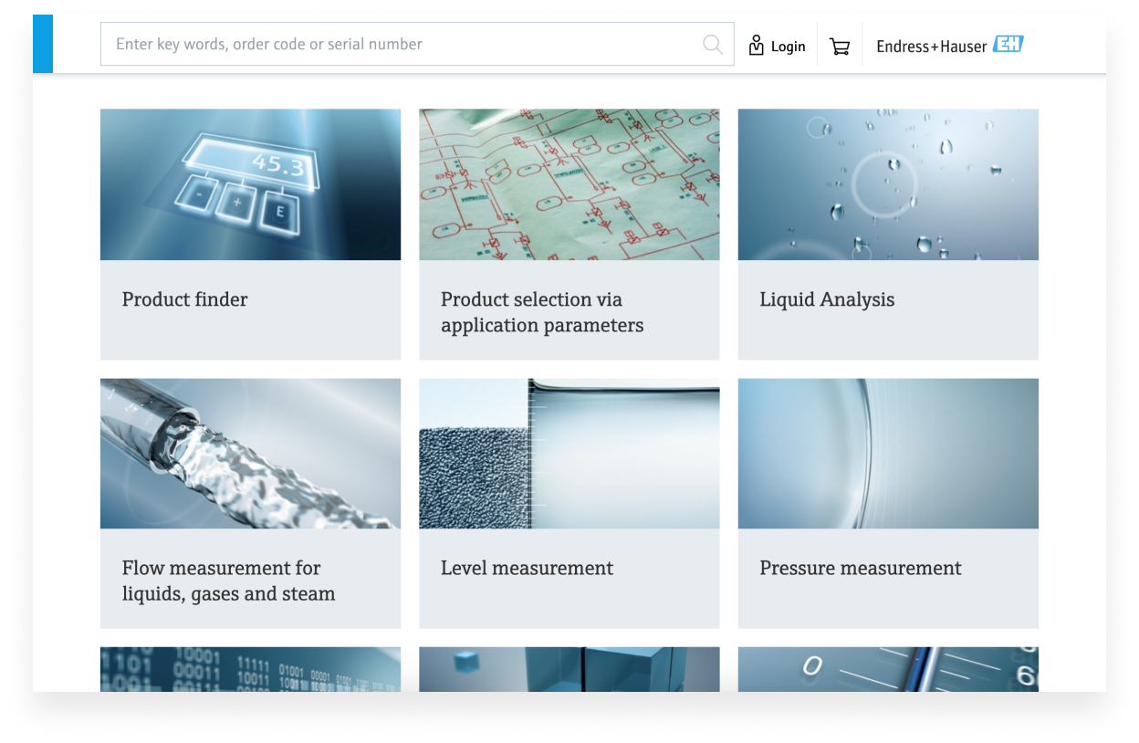
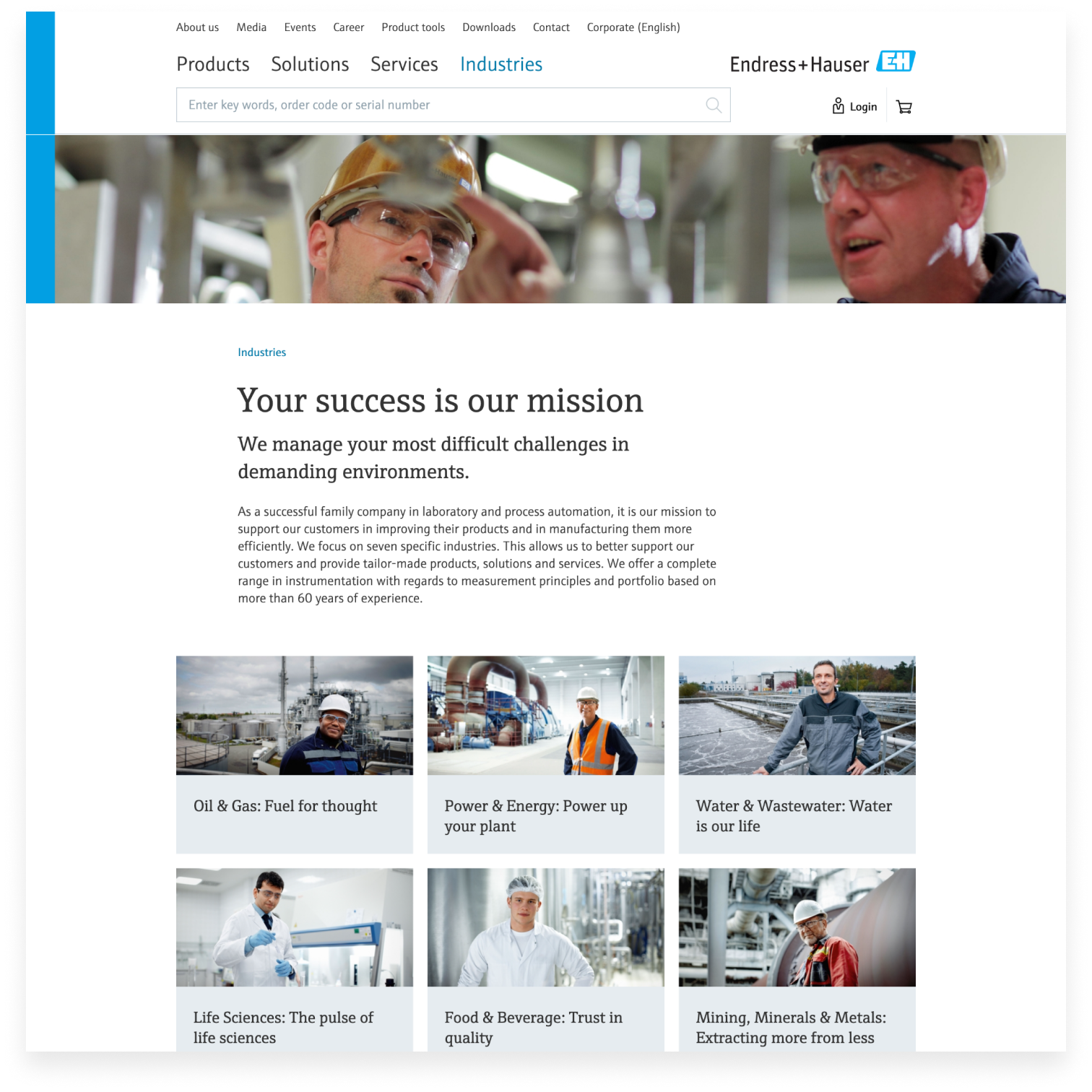
It quickly became clear that we had to reduce noise on the website and give the user better guidance to navigate his way around. We developed a new content navigation structure that reduced clutter and helped the user find his way around the large amount of content.
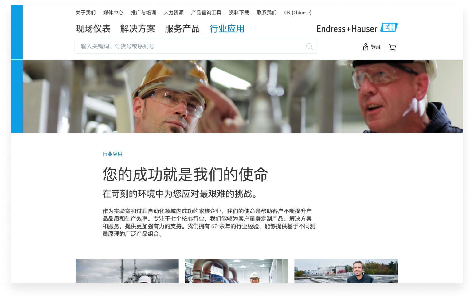
Another challenge that we had not anticipated at first was the website’s multilingual requirements. While we were aware that the website should be usable in more than 20 languages, there were times we had to adapt the design according to user feedback from different parts of the linguistic world. For some languages, we learned we had to adapt our usual patterns and accommodate the design.
Early on, the team made the decision to take a mobile-first approach to the project. While this was rather unusual for the client, it helped us simplify the complex architecture of the existing Endress+Hauser website and ultimately place the user in the center of all pieces of content. The revamped mobile user experience taught us things that we could directly apply to the desktop version of the website.

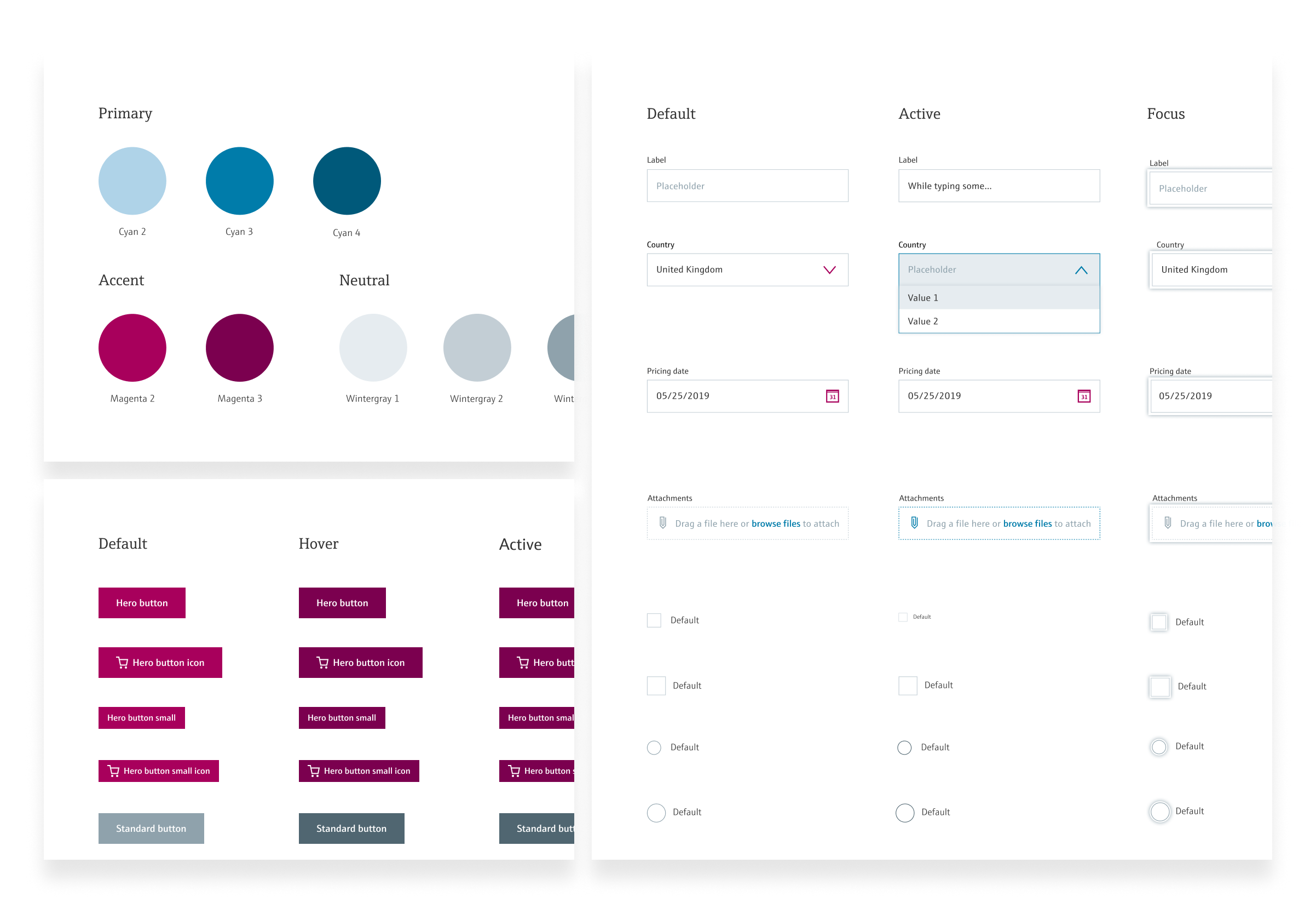
From the beginning, we worked on a thorough documentation of our design decisions, which later built the foundation of a fully fledged style guide.
We challenged the branding guidelines of Endress+Hauser and came up with new and improved user interface design elements and components. The team created a library that allows the designers to stay consistent throughout all projects. Simultaneously, we wrote functional specifications for the company’s implementation partner to make sure that the final result would match our concepts. Today, this helps us work on several projects in parallel, while ensuring a consistent look and feel. It also helps our development partners work more efficiently.
The key output of the design process turned out to be the solid foundation of a style guide. We have since been able to build on this system and continue to benefit from it on current projects for new Endress+Hauser products.
Thanks to Ginetta we were able to make our website much more user-friendly and innovative. For all updates that we carry out on our company website today, Ginetta is firmly implemented in our development process and advises us in a goal-oriented and competent manner so that users of our website can inform themselves and transact with us easily and quickly.
Today, Ginetta still supports Endress+Hauser on projects in numerous different disciplines. We make it our primary focus to act as the users’ advocate while continuously building up on the foundation we created. Thanks to the workflow that we have now established together with Endress+Hauser, new features are constantly being researched, built and tested to improve the company’s overall digital presence.
Through these continuous improvements, Endress+Hauser is able to offer their customers an experience that focuses more on self-service. This gradually allows their workforces to focus less on administrative processes and more on crucial tasks. Here's how:
Following the initial improvements of the Endress+Hauser content navigation, the work was not quite done yet. The content of the pages still had potential to be structured in a user-friendly manner, consistent in their wording and more comfortable to read. Hence, the team restructured many content heavy pages on the Endress+Hauser website, always attempting to find the right balance between maintaining good SEO and cutting the content according to UX writing best practices.
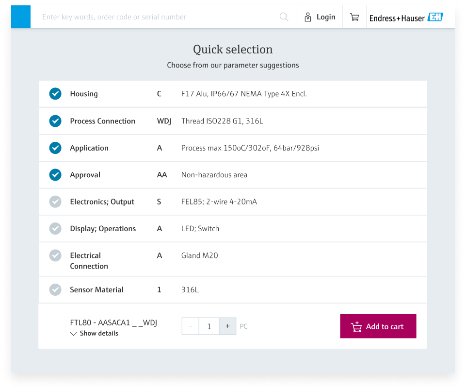
The products that Endress+Hauser provide are powerful and hence can have a certain complexity to select the right one as most of them can have up to 15 configuration options. Our task was to simplify this process, while maintaining all needed functionalities. We came up with a solution which guides the user through the process and only takes him through the most important parameters. Endress+Hauser's technical partner then developed an algorithm, which can complete the parameter selection according to the most used and the most plausible options. Simultaneously, the entire ordering process and online customer service area was redesigned to achieve a unified experience from product configuration to the reception of the equipment.
We realized the website's traffic counted many returning users who knew exactly what they were searching for. Taking this into consideration, we developed a concept to make the search quicker and easier to access. A successful search function is very challenging to implement, which is why we worked on a long-term vision that could be implemented part by part, while the technical requirements were progressively solved.
We are looking forward to even more close collaboration, friendly discussions, challenging topics and successful implementations in the projects that are to come!
It was crucial for the success of the project that we understood the context and needs of Endress+Hauser very well. We therefore worked closely and intensively together in many workshops. This enabled us to build mutual trust and create an ideal working atmosphere.

Jessica Mueller
Design

Corina Bertschi
Design

Katharina Herzog
Design

Joel Sinnott
Design

Fiona Tinner
Writing
Simone Reichlin
Research

Silvia Wels
Research

Marvin-Sebastian Karácsony
Business

Simon Raess
Design Strategy