Basler & Hofmann
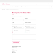
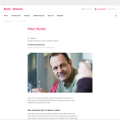
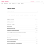
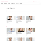
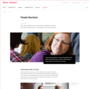
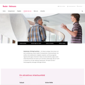
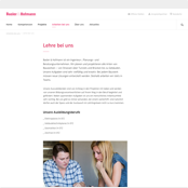
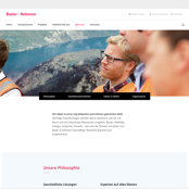
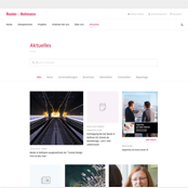
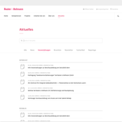
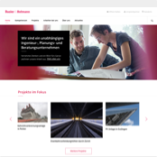
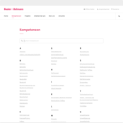
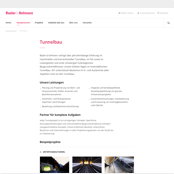
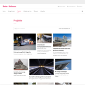
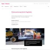
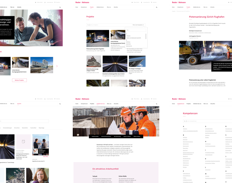


A top Swiss engineering firm with offices around the world, Basler & Hofmann has been setting benchmarks in engineering consultation, planning, and execution for over 50 years. Ginetta crafted a responsive CMS website capable of showcasing Basler & Hofmann's breadth of expertise and unique working environment, with the goal of attracting both new clients and new talent.
These days a modern website is necessarily a responsive website. Designing
for handheld devices first as a rule – «mobile first» – has also become
a common practice, and it was the approach we took with the Basler Hofmann
website. Designing within the constraint of limited screen space
forced us to prioritize every single item of content on every page. On
content-heavy websites, this is an absolute must.

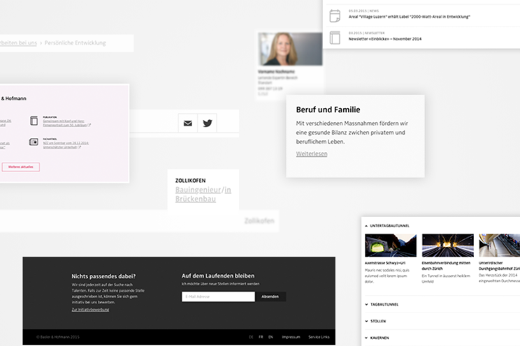
Transitioning projects from design to front end to back end development requires excellent communication. Everyone needs to be talking about the same thing. To ensure this would be the case, designers and developers collaborated on and documented interface modules long before the implementation phase began. Ultimately, our goal was to create a logical system of building blocks, making it simpler to add additional content to the website or to use existing code in new projects.
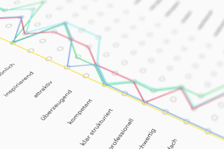
One of the tricky aspects of a corporate website is communicating brand values and making the right impression on your audience. Luckily, we have some experience in that field. Using semantic differentials, we evaluated users' impressions of the design. In tests, users overwhelmingly judged the website to be approachable, trustworthy, and professional.
Basler & Hofmann's strength is their experience across a tremendous 80 fields of expertise. We developed a scoped search to allow users to restrict their search to projects in specific areas. To improve usability of the scoped search, we made it possible to search within the options — as the user types, they zero in on only those fields of expertise that are most likely the category they're looking for.
Screencast of a search within projects
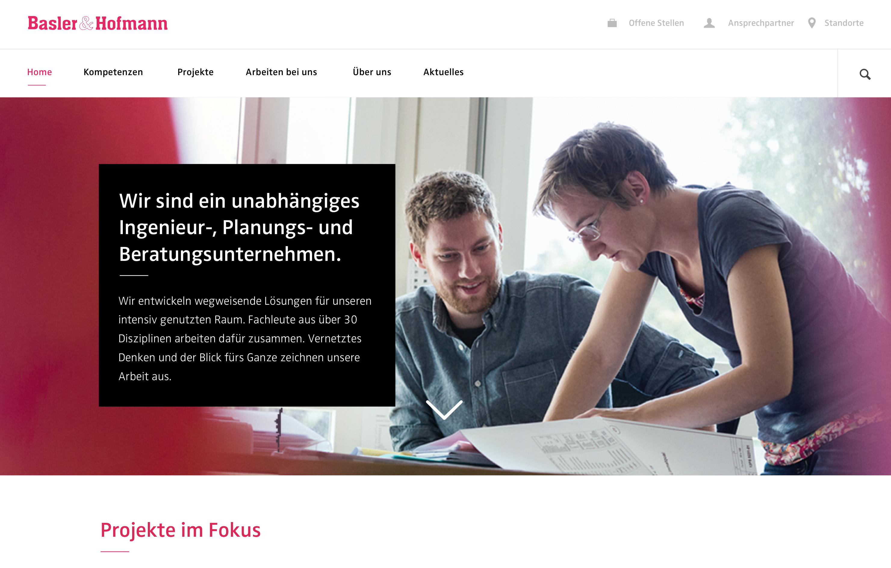
Homepage
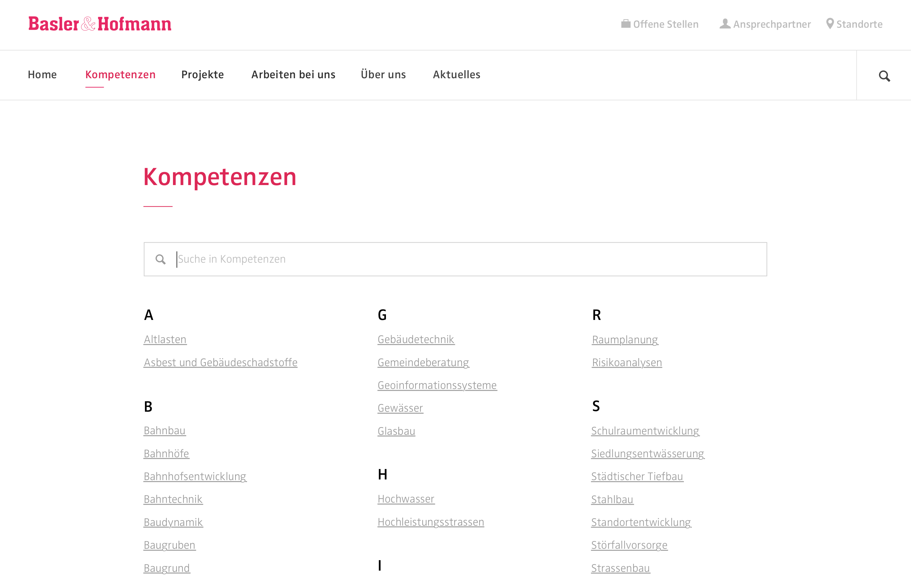
Index of areas of expertise
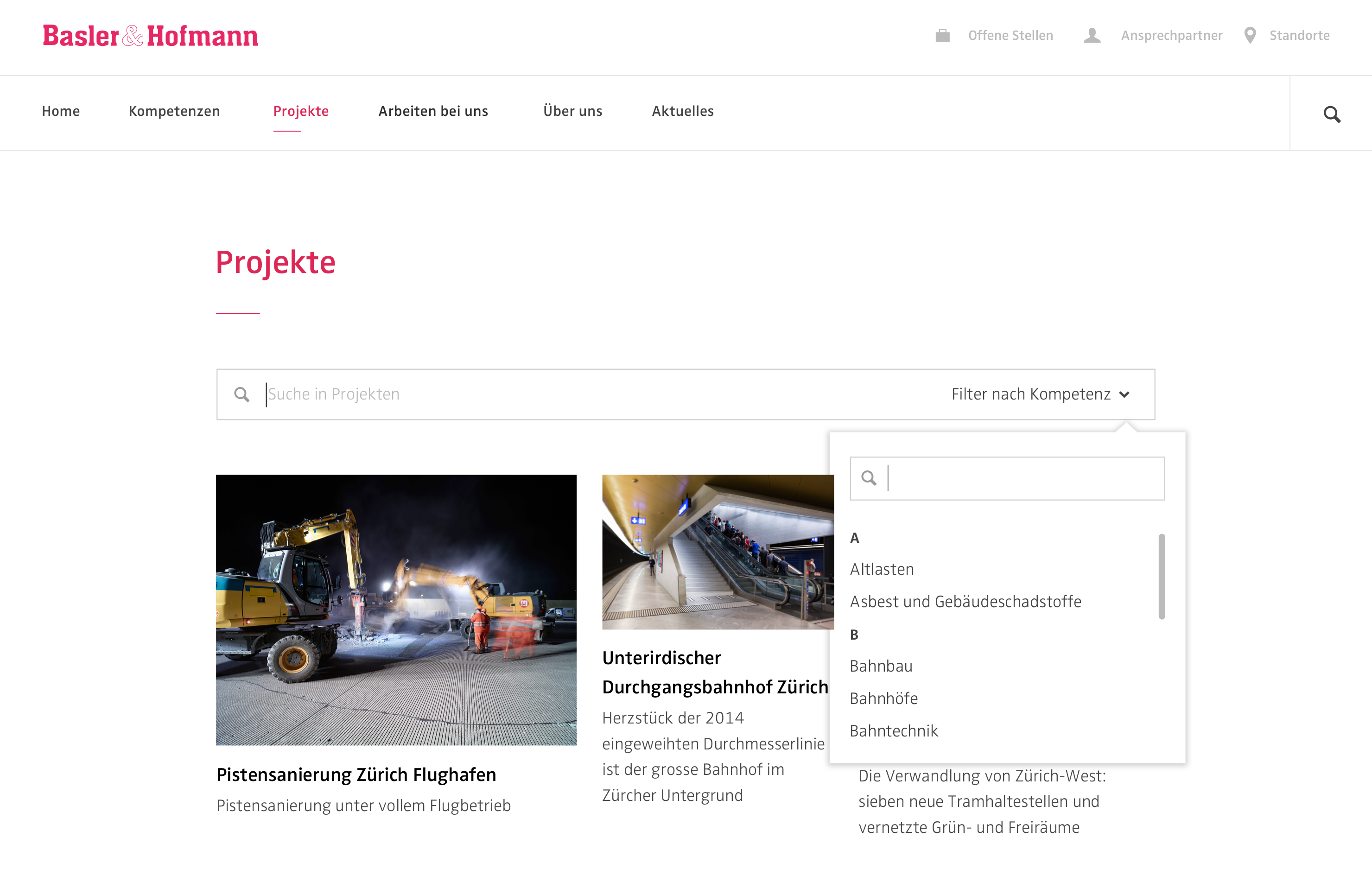
Project overview
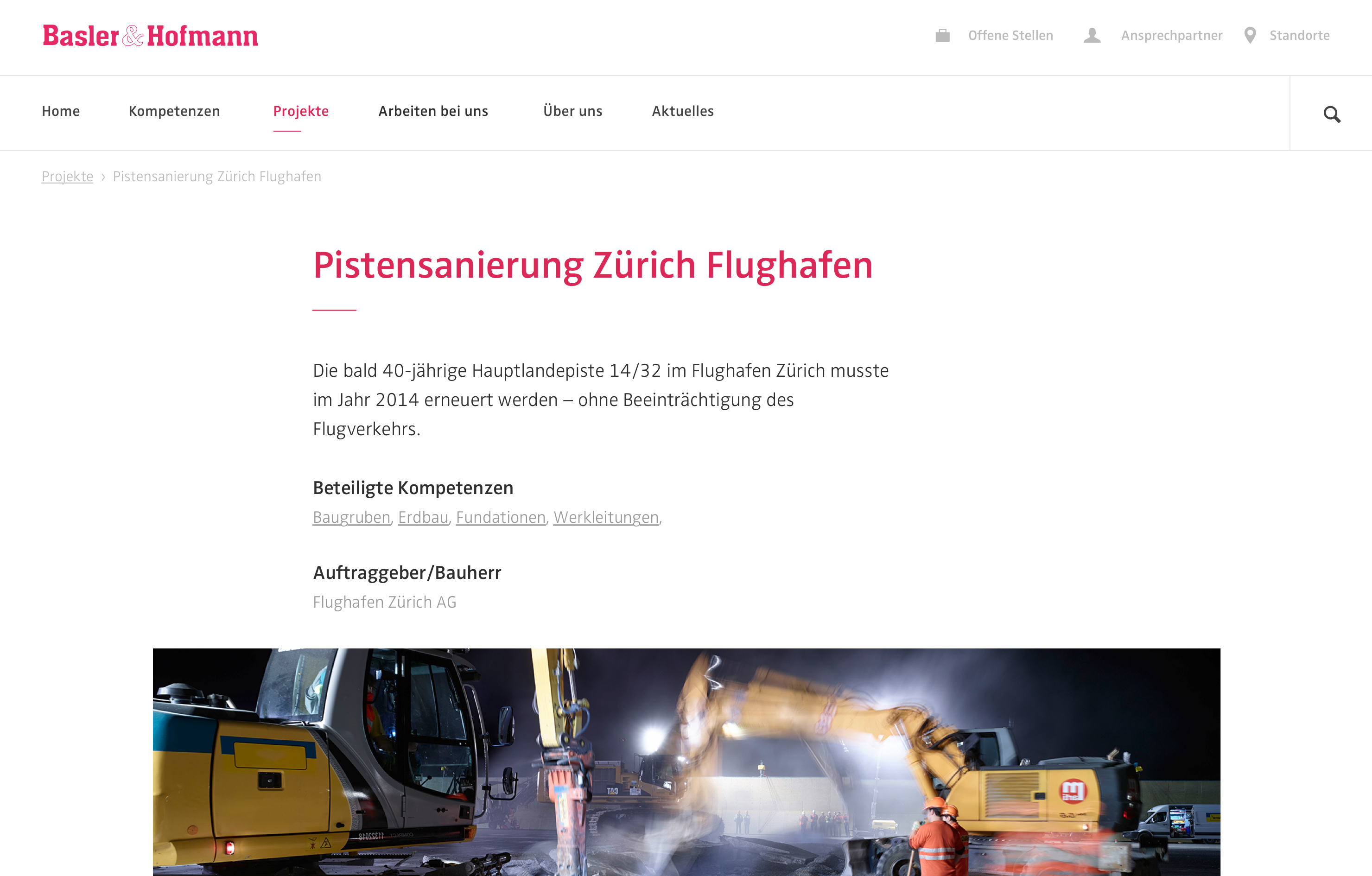
Project detail
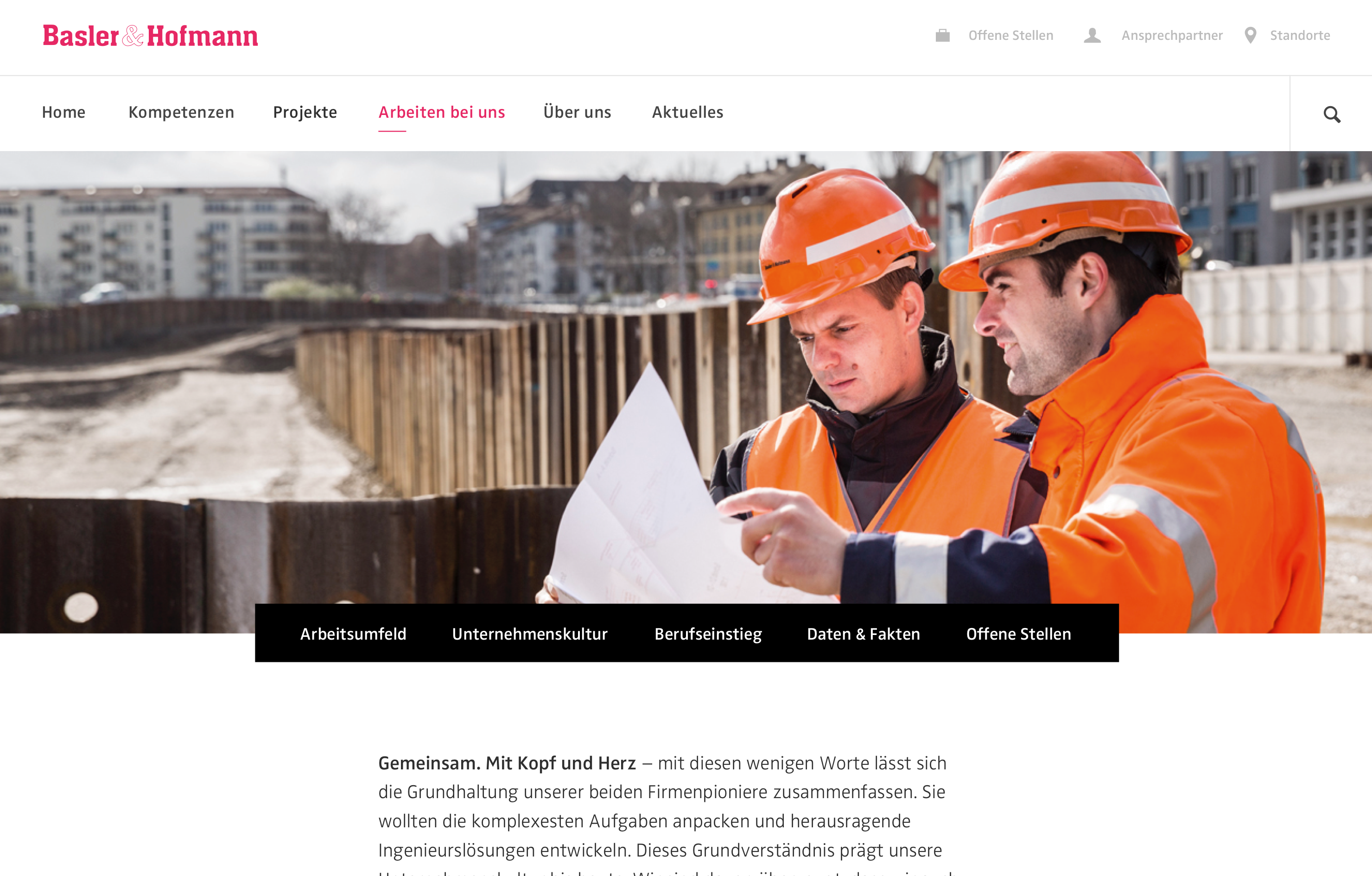
Working at Basler & Hofmann
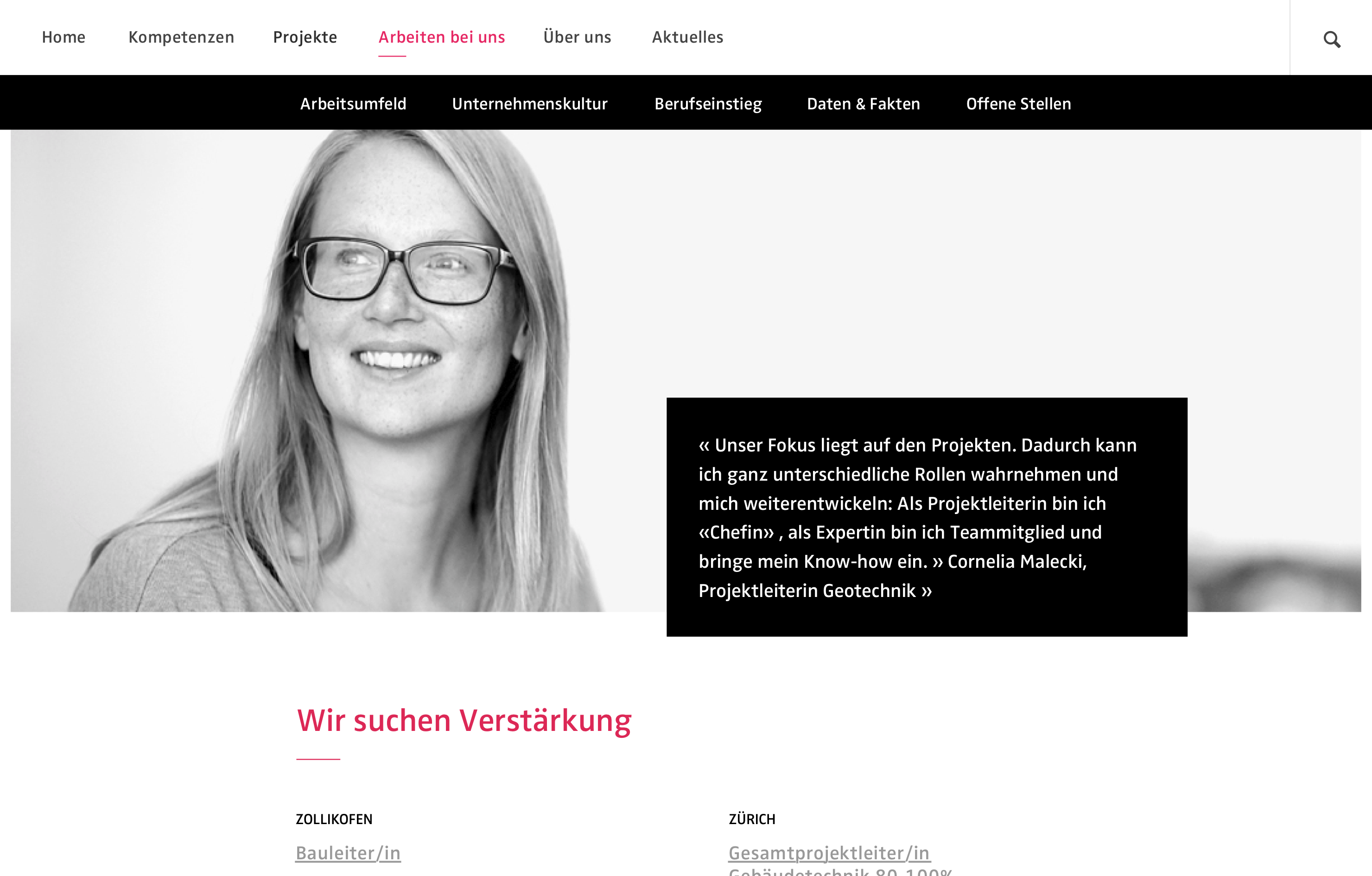
Sticky sub-navigation
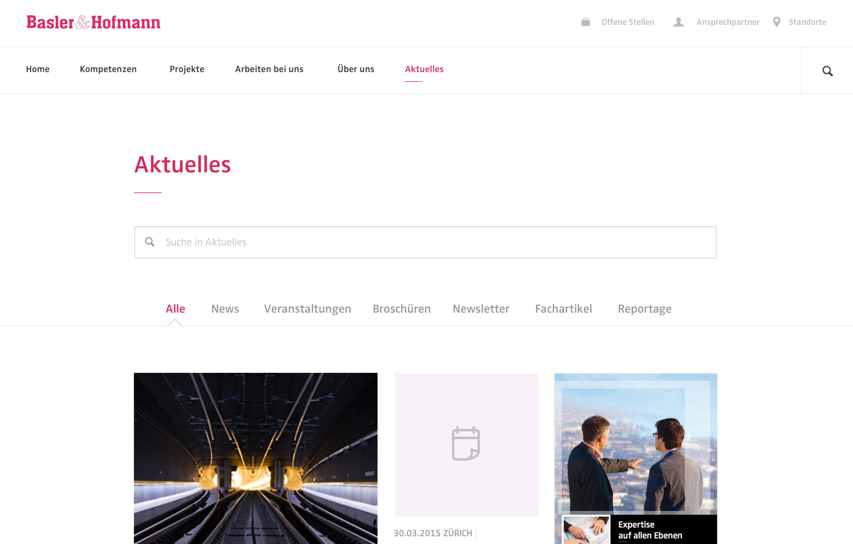
Current events, news, and publications
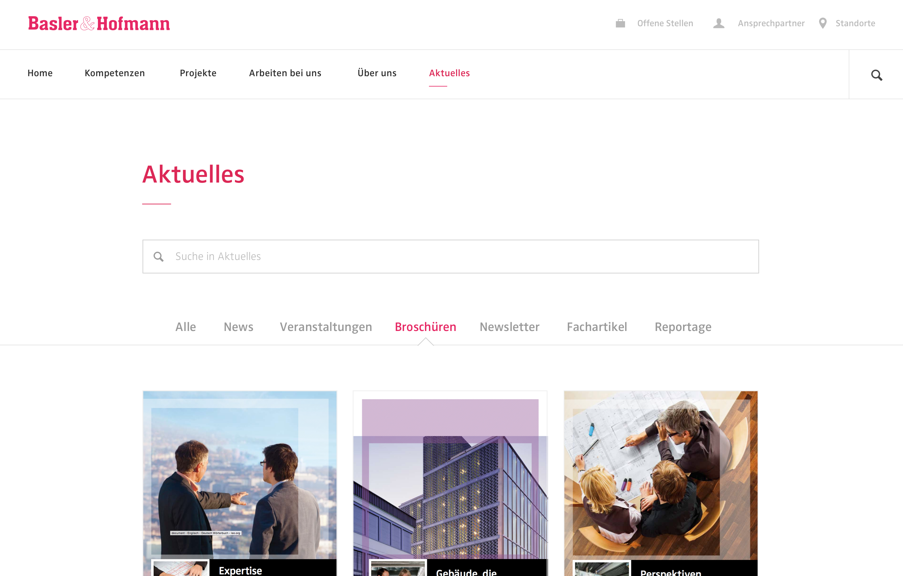
Brochures
The resulting website is optimized for small, medium, and large devices. Modularity gives editors the flexibility they need to create additional content without «breaking» the design.
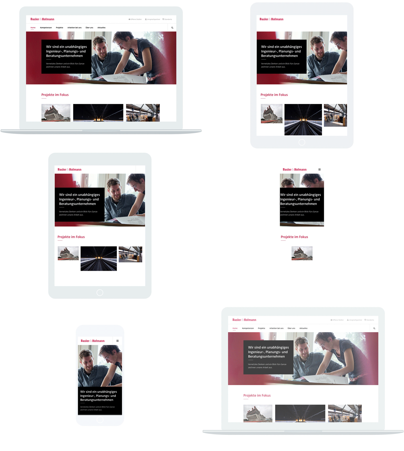
We had a blast building a scalable and modular digital presence for Basler & Hofmann.

João Figueiredo
Frontend

Jessica Goodson
Design
Simone Reichlin
User Research